NINE Cosmetics
A UX case study focused on optimizing the mobile shopping experience for a luxury lip care brand. This project explores how thoughtful design choices can reduce cart abandonment and boost user confidence. The result is a streamlined, visually elevated e-commerce concept that makes beauty shopping feel effortless and engaging.
Role
UX and UI Designer
Year
2025
Problem Space
The company wants to enhance its web shopping experience to make it easier for users to browse, find their perfect shade, and complete checkout without friction. Current data shows high product-page engagement but low conversions with users often admiring products but abandoning before purchase. The goal is to create a seamless, intuitive, and visually elevated e-commerce experience that boosts confidence and increases completed purchases.
Goals
Conversion
Improve the conversion rate from browse to completed checkout on the web experience
Confidence
Build user confidence in color selection through visual aids and comparison features.
Checkout
Reduce cart abandonment by implementing a guest checkout option that captures email while minimizing barriers to purchase.
Target User
Demographic
Primarily women ages 20–40, interested in beauty and self-expression.
Needs
Quick, confident shade selection and frictionless checkout
Pain Points
Uncertainty about shade match, slow load times, mandatory registration before purchase.
Research Plan
To design the e-commerce experience, I need to understand what works in the online shopping flows of existing lipstick and makeup brands. Competitive benchmarking, paired with a content audit, will highlight both UX patterns and brand storytelling opportunities
1|
Discover
Competitor analysis and content audits will allow me to quickly understand what’s already successful in the market and what gaps exist. This gives me actionable insights into user expectations while saving time compared to primary research.
Design
2|
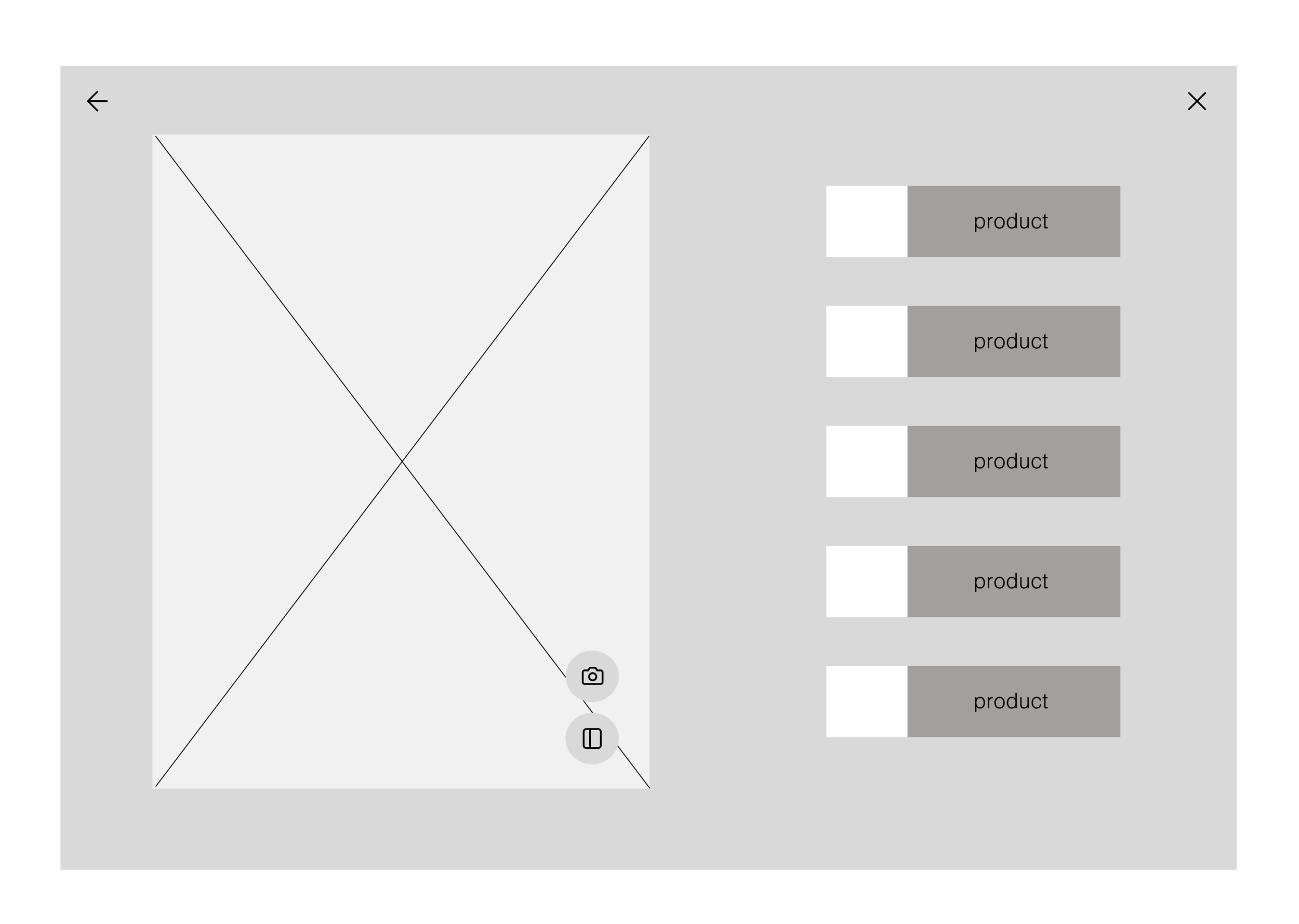
Mapping user flows ensures the navigation structure is intuitive before investing time in visuals and a low-fidelity prototype will allow me to explore multiple solutions quickly and prioritize usability over aesthetics.
3|
Test
A structured test script helps gather reliable feedback and keeps the test focused on validating core usability rather than visual polish. Documenting results ensures findings are not lost and can be directly applied to improve the next design phase.
4|
Iterate
Tailoring a second script to focus on interaction details ensures I gather feedback on both usability and visual design.
Validate
5|
Incorporating a high-fidelity prototype at this stage enables realistic user testing before the final iteration.
Re-Design
6|
Using insights from the previous testing rounds, the final Figma designs will be refined to balance usability and aesthetics.
Phase 1
Discovery
The company wants to enhance its web shopping experience to make it easier for users to browse, find their perfect shade, and complete checkout without friction. Current data shows high product-page engagement but low conversions with users often admiring products but abandoning before purchase. The goal is to create a seamless, intuitive, and visually elevated e-commerce experience that boosts confidence and increases completed purchases.
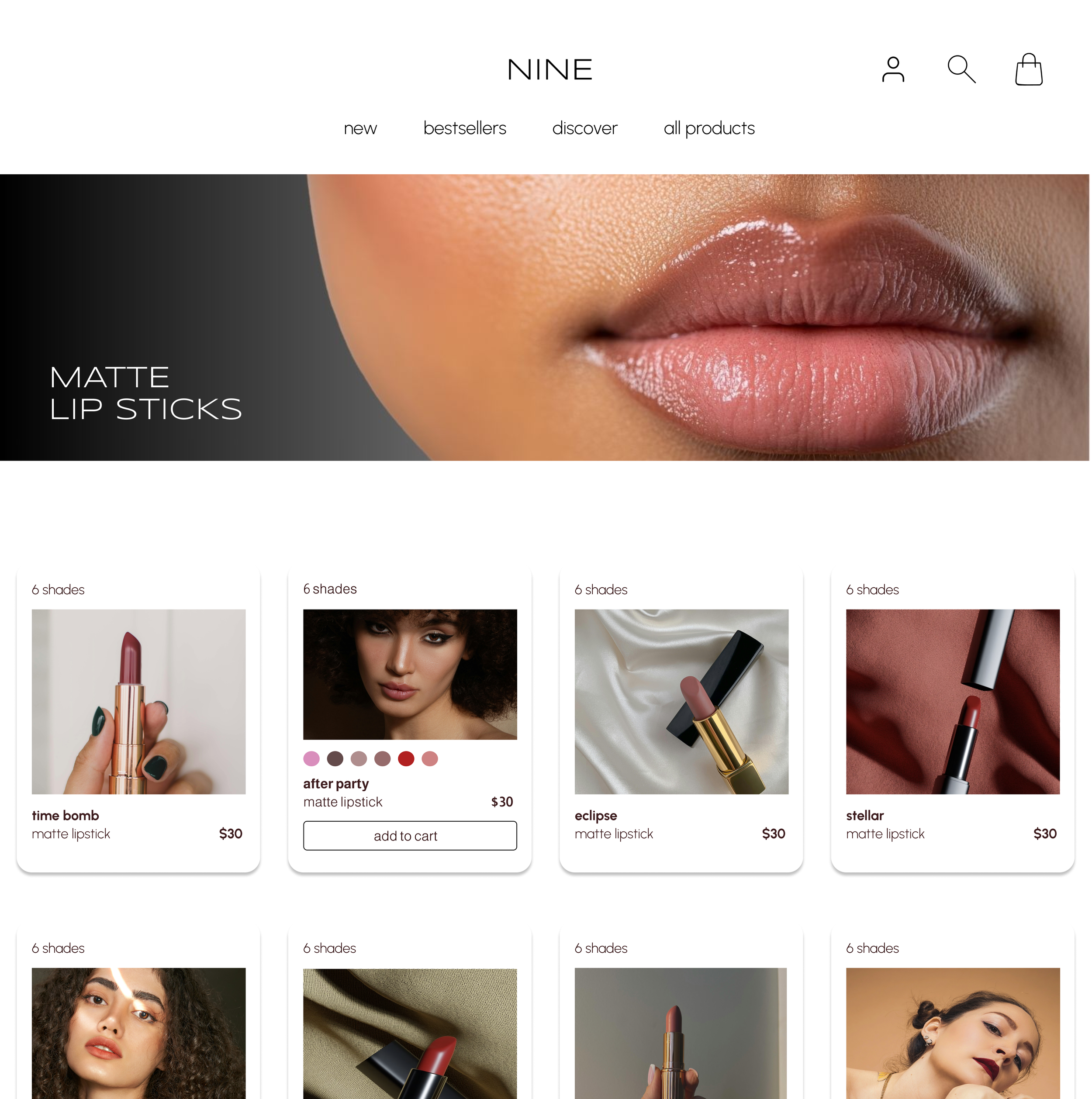
Competitor Analysis and Content Audit
Identifying the UX patterns that make it easy for users to explore and compare lip shades, the features that build confidence in their selection, and the checkout flows that minimize friction. To do this, I analyzed two major industry leaders and three niche beauty brands to understand what drives trust, ease, and conversion in the online shopping experience.
1|
2|
KVD Beauty
A bold, rebellious makeup brand originally founded by tattoo artist Kat Von D. Now known as KVD Vegan Beauty, the brand leans into edgy, alternative aesthetics.
An indie makeup brand founded by three sisters, inspired by naturalism, mysticism, and ritual.
3|
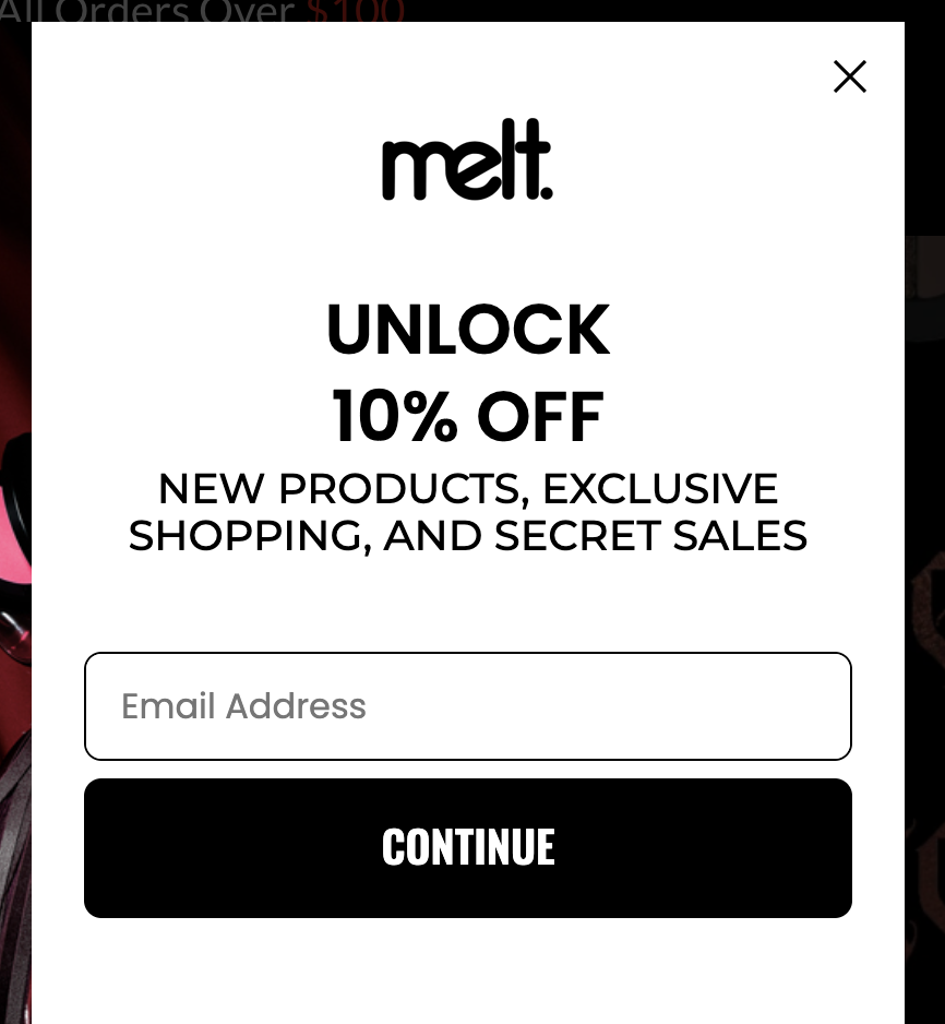
Melt Cosmetics
4|
Glossier

5|
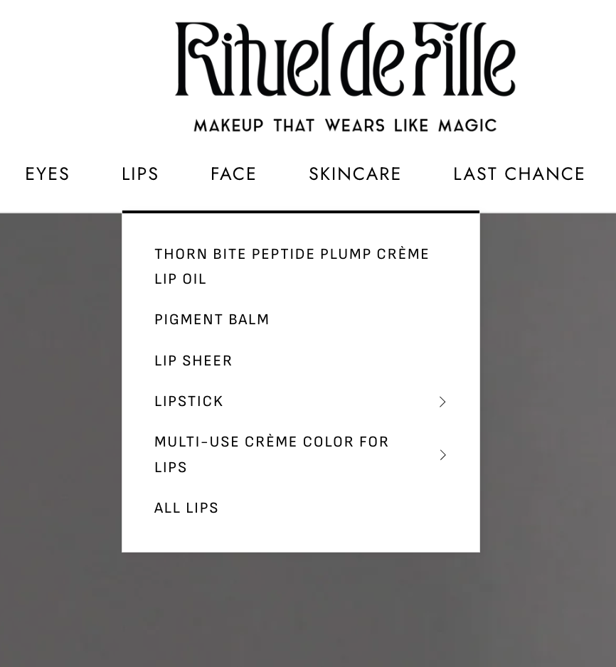
RITUEL DE FILLE
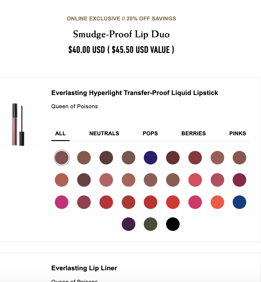
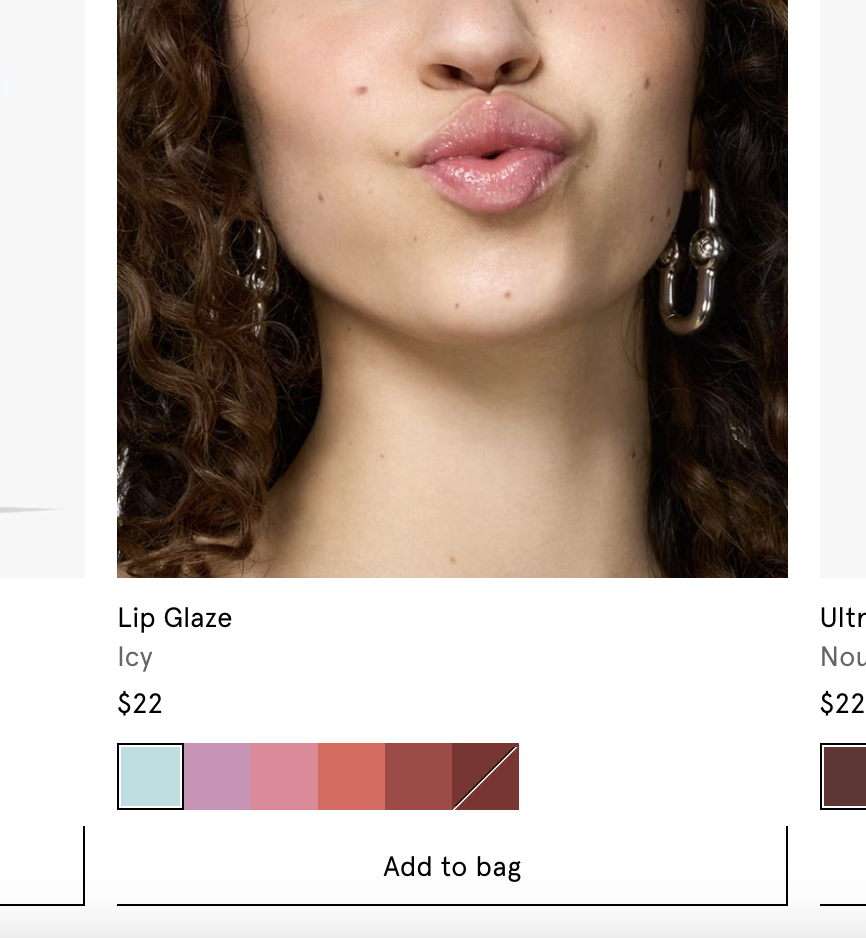
What Works
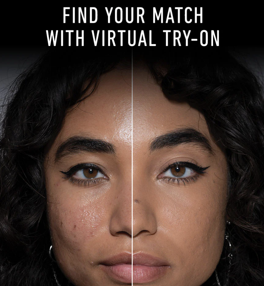
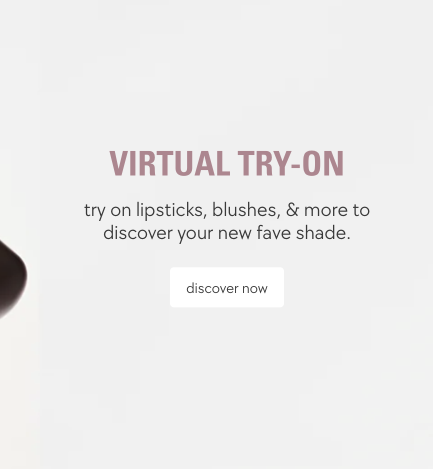
Virtual try-on tool boosts shade confidence
Strong, emotional copy and shade names (ex: Queen of Poisons)
Clear trust signals: free shipping, free returns, vegan/cruelty-free badges.
A bold, edgy indie makeup brand founded by professional makeup artists, known for pushing boundaries in color and style.
A minimalist, millennial-focused beauty brand born from the Into the Gloss blog, built around the idea of “skin first, makeup second.”
Kylie Cosmetics
A celebrity-driven beauty brand founded by Kylie Jenner, built on the success of her viral “Lip Kits.” Glamorous, trend-driven, and exclusivity-focused.
What Works
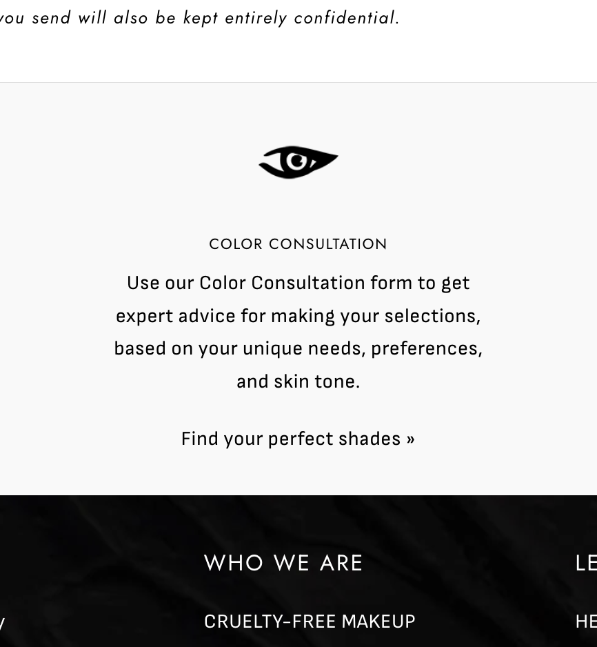
Color Consultation tool. Great for guided discovery
imagery and visual content amplify brand identity
Splits scrolling allows users to view the product details while also viewing visual descriptions
What Works
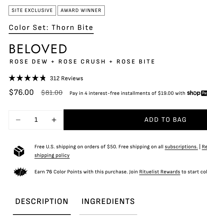
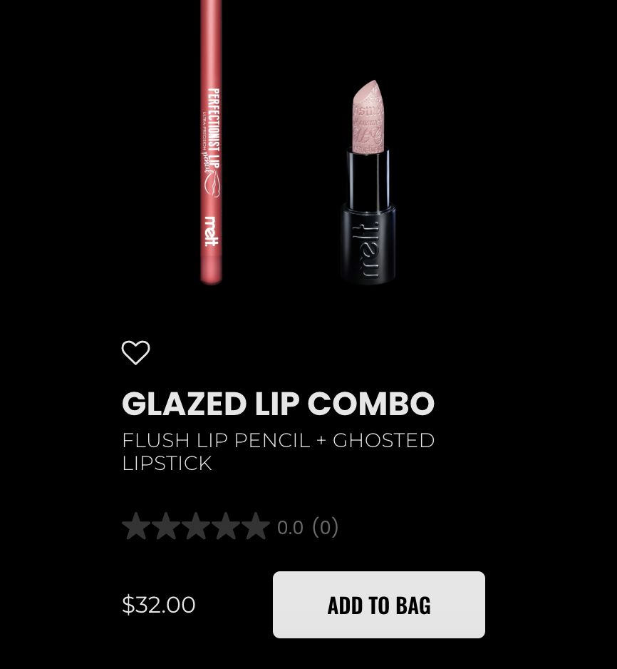
“Add to Bag” button on PLP tiles speeds up purchase without forcing PDP click
Ingredient transparency
Hype culture (“Exclusive Access,” “First Drops”)

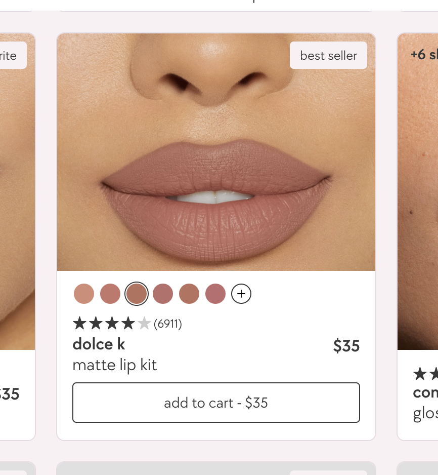
What Works
“Add to Bag” on PLP tiles streamlined shopping
Minimalist, clean design
Shade Finder with multiple skin tones
What Works
“Add to Bag” on PLP tiles for fast access to purchase
"Shade Finder Quiz" guided shade discovery
Hover effects over PLP tiles for additional shade options

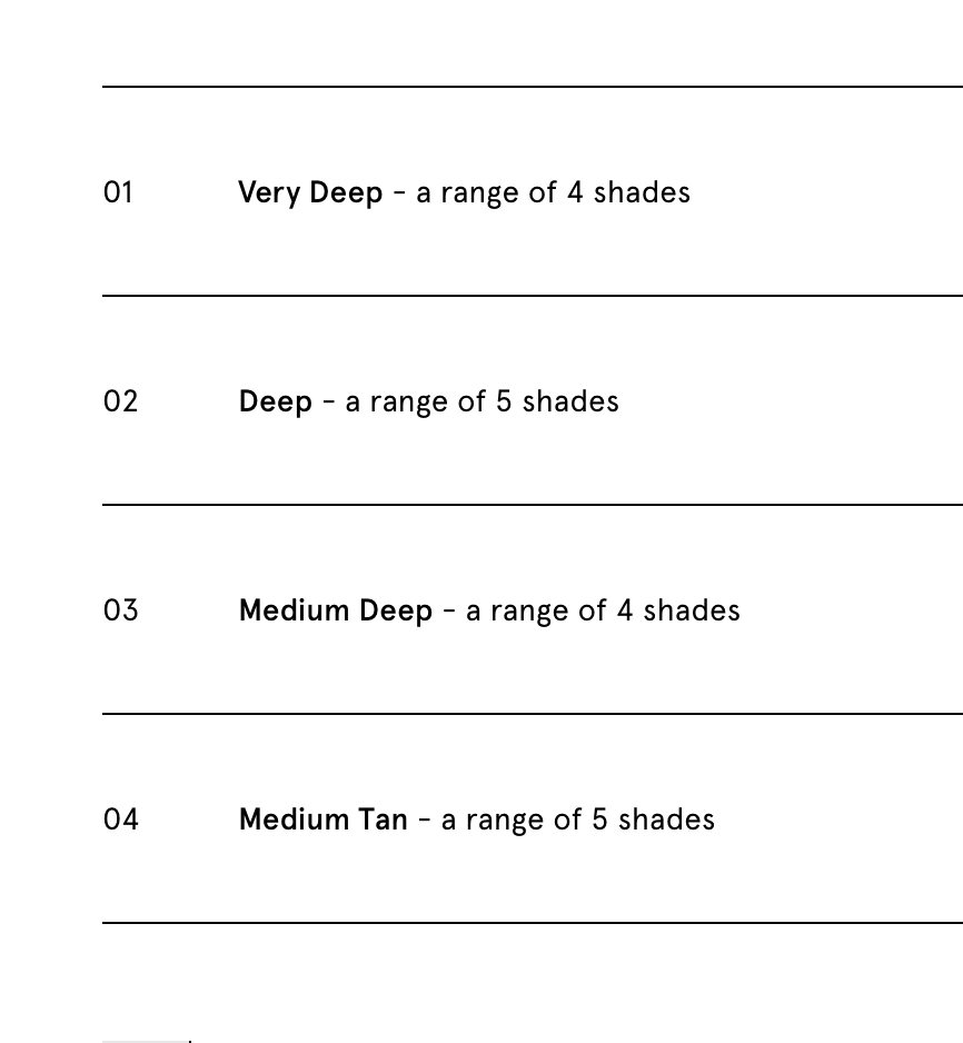
Findings Summary
How do these sites help users explore & compare lipstick shades?
Virtual try ons, shade finders, and multi-tone visuals are the strongest trust-builders. Evocative names amplify emotional confidence. Most brands rely on quizzes or PDPs for shade discovery, with limited PLP swatch visibility. users must click around a lot.
How do these brands structure cart & checkout to reduce friction?
Quick-add and side-panel carts (Glossier, Melt) reduce friction best.
How are visuals, copy & layouts used to reinforce brand identity?
Each brand ties visuals and copy to identity (rebellion, ritual, punk, minimal, glam, etc). Consistency between copy and imagery reinforces emotional connection. Branding is most prominently portrayed through headers, font, logo branding, and color pallets.
Where do users potentially drop off or feel frustrated?
Biggest friction is that shade exploration requires too many clicks. lack of PLP swatches and limited filters cause hesitation and drop-offs. Also helpful features such as virtual try ons and shade finder quiz’s were rarely easy to find.
Opportunities
Swatch grids and shade filters right on PLP
Prompt users to use special features and make sure they are easy to find
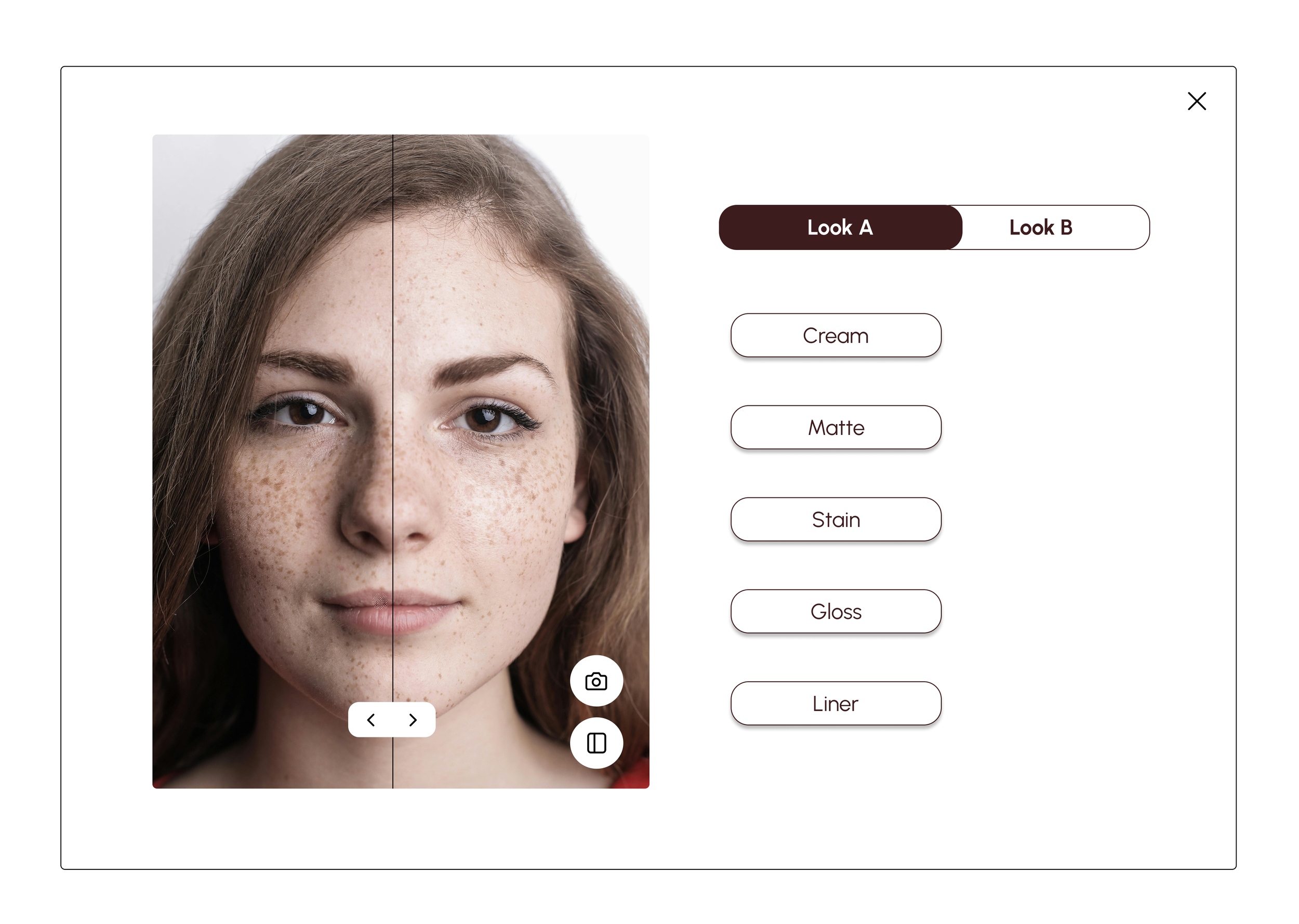
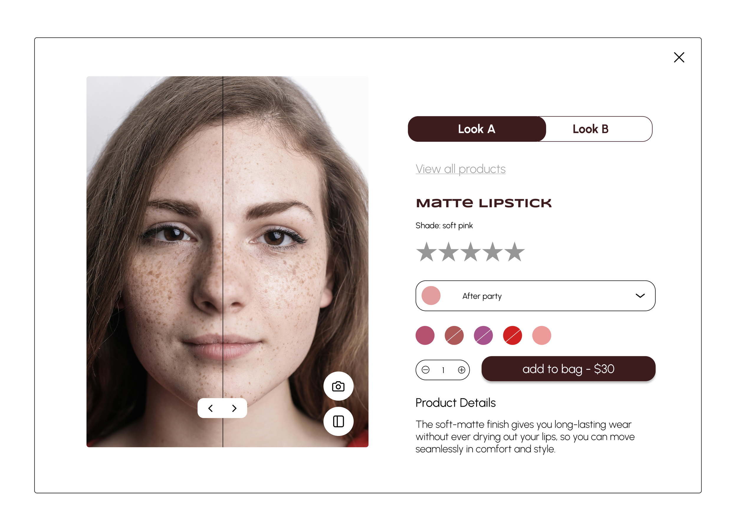
Boost confidence with selfie uploads, multi-tone previews, split-screen comparison
Side-panel cart with quick edits
Guest checkout first and progress bar
Unified brand tone
Phase 2
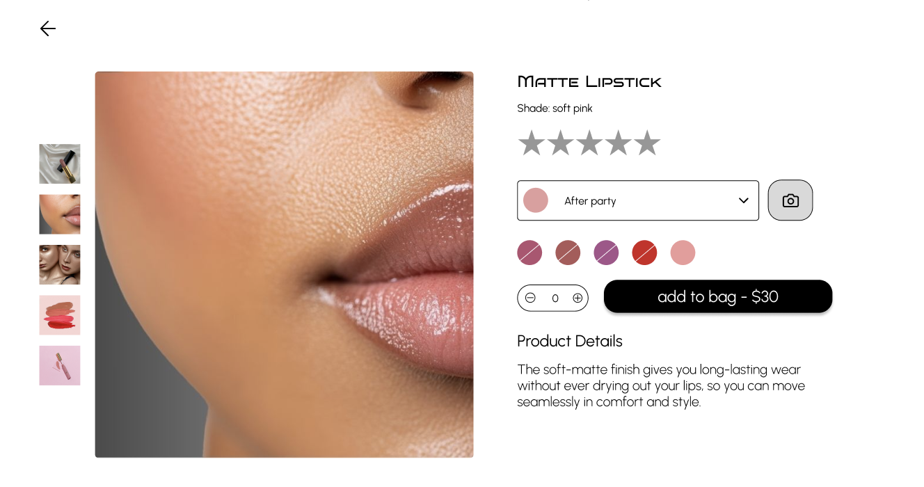
Design
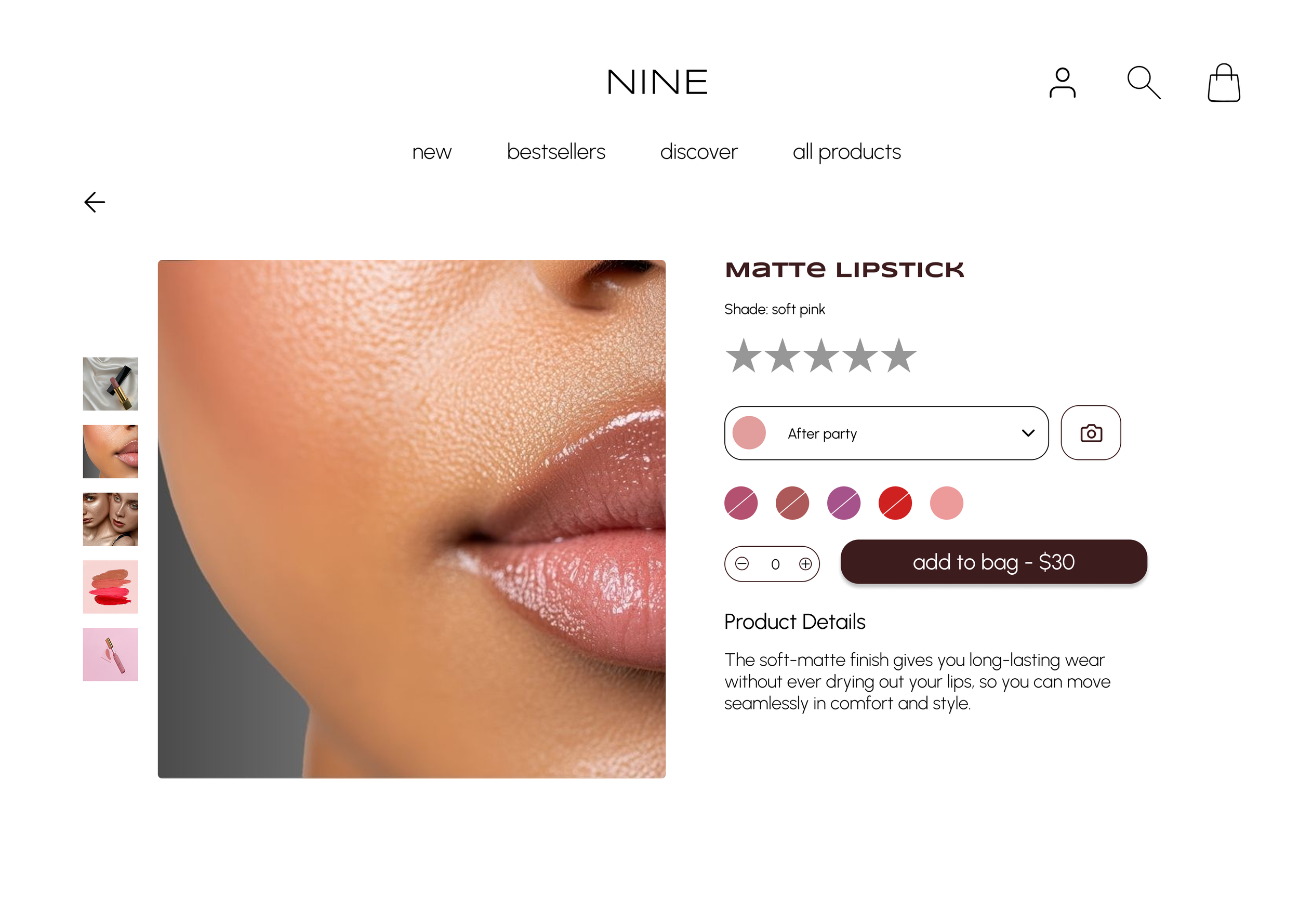
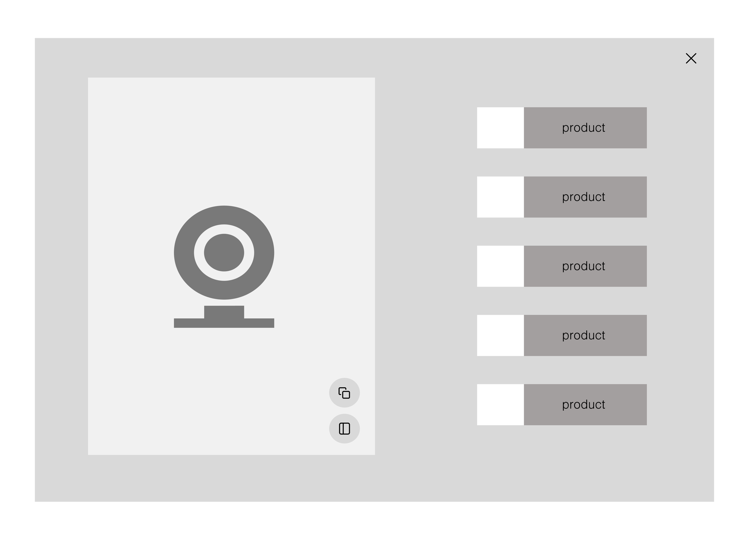
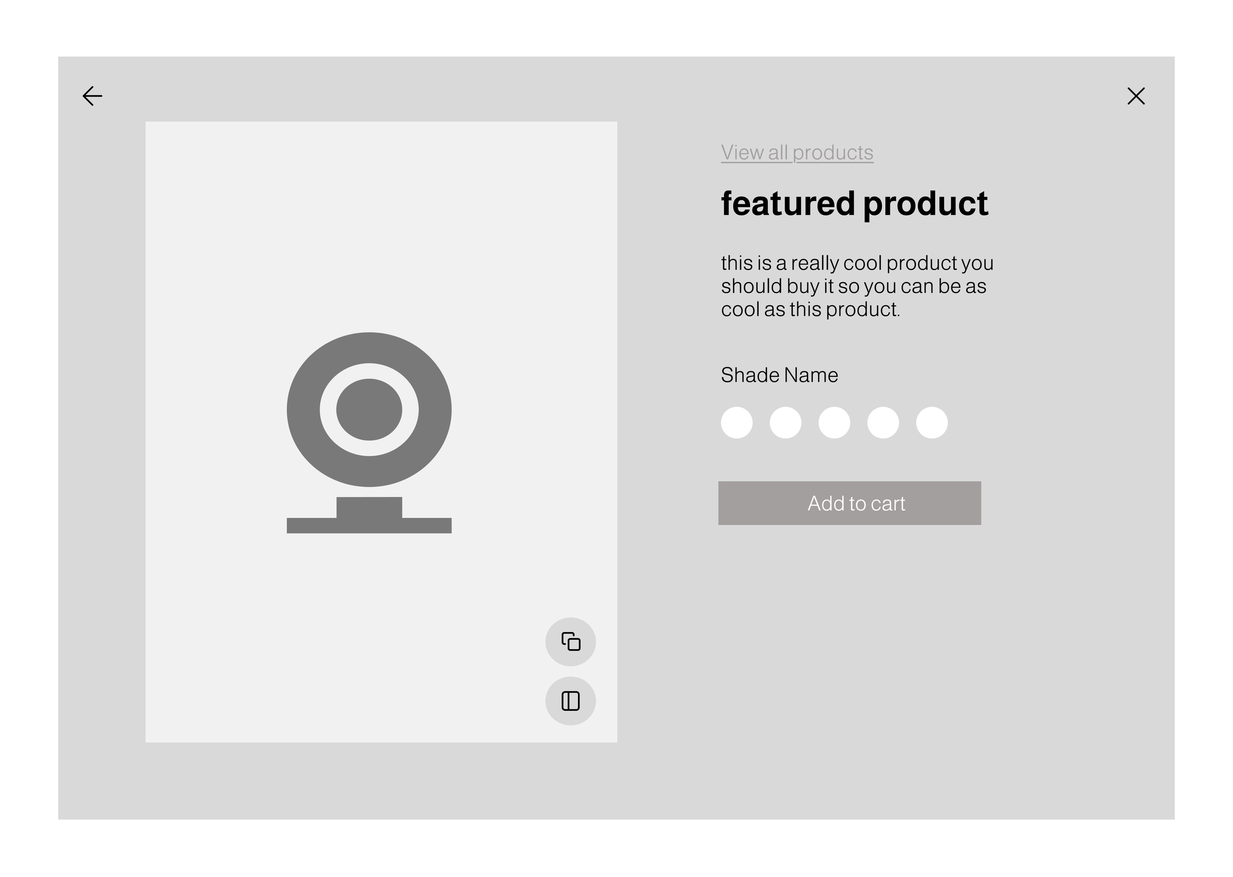
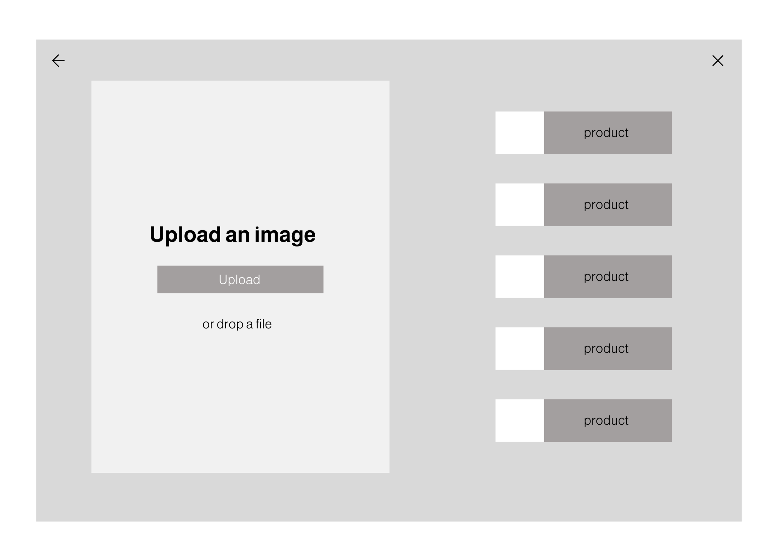
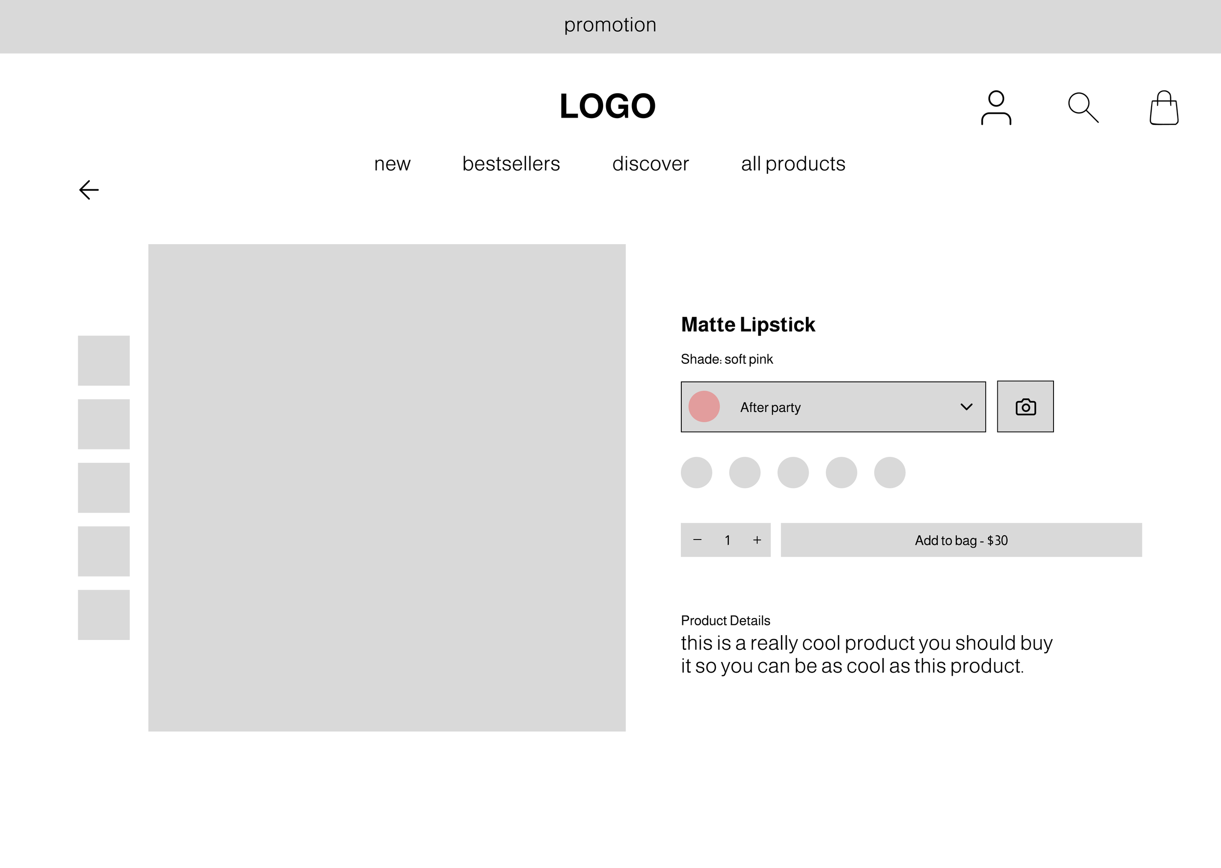
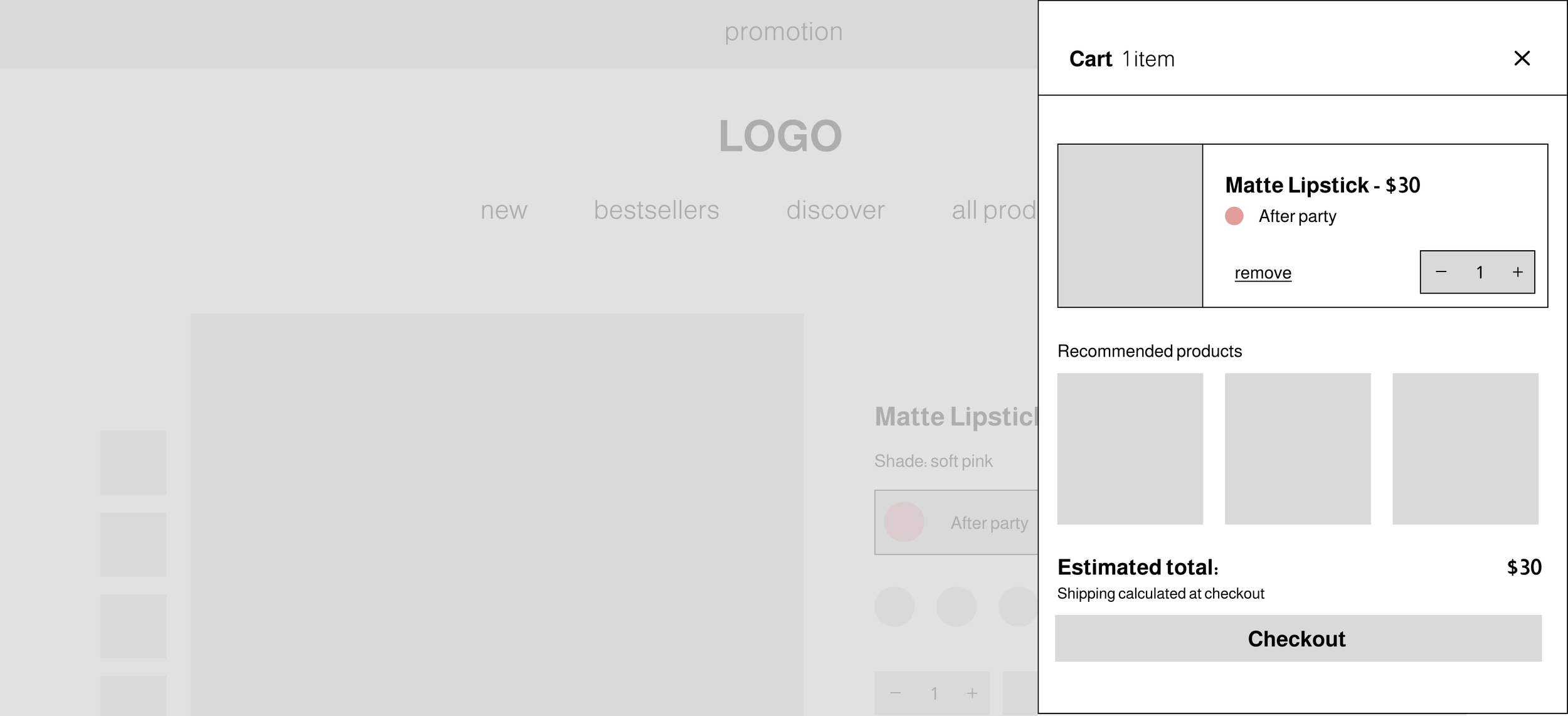
I developed two key user flows to define how shoppers would interact with the website: Finding a Color Match and End-to-End Purchase. The color match flow focuses on helping users confidently select the perfect lip shade through guided options like uploading a selfie or choosing from a curated tone palette. The end-to-end purchase flow maps the complete shopping experience designed to feel smooth, familiar, and free of unnecessary steps.
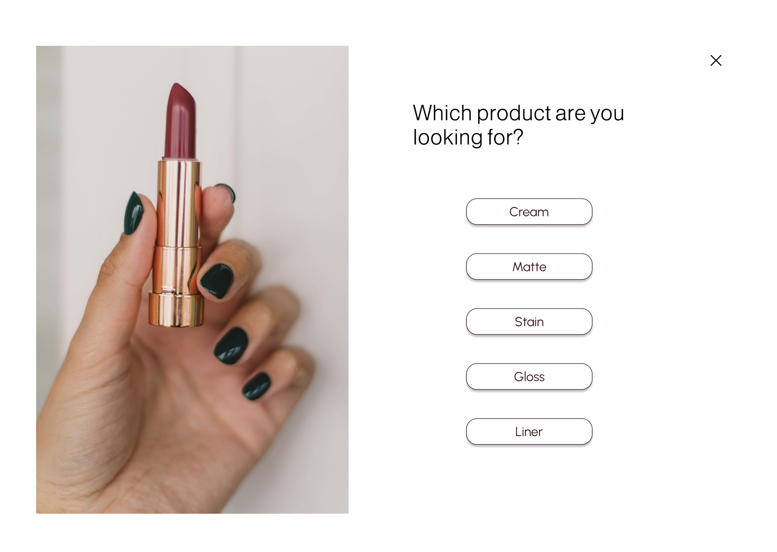
Lofi Screens
Phase 3
Testing
Interviews with Participants
The usability test aimed to evaluate how effectively users could try on and compare lip product shades using multiple methods, while identifying any pain points or friction within the shopping and checkout process. The priority was focused on understanding whether users felt confident navigating through the interface.
Participants: 5
Time: 30 minutes each
Format: moderated in person
Task 1
Use the virtual try-on feature with your webcam to test a few shades.
Task 2
Upload an image of yourself and apply a few shades.
Task 4
Compare two shades using the split view feature.
Task 3
Complete the short skin tone quiz to find your best shade.
Task 5
Add a shade you like to your cart and go through the checkout process.
Observations
Homepage and Navigation
Participants could locate key sections but some hesitated between icons and labels (P2, P4). Clearer iconography or labels would help.
Features
Users understood where these features would live but wanted clearer differentiation between the two (P1, P3). Users understood the comparison concept but were unsure how to access it from the shade browsing screens without guidance (P3, P5).
Checkout Flow
Participants could move an item into the cart and navigate toward checkout, but several (P2, P4) mentioned wanting reassurance that they were progressing correctly since the flow was still very skeletal.
Phase 4
Iterations

#3D1C1E
#E1C5C5

Phase 5
Validate
Following the first round of usability testing, iterations were made based on participant feedback to improve both functionality and overall design. I then conducted a second round of testing with five new participants to validate these updates. While the tasks remained consistent with the initial session, this round placed additional focus on evaluating the visual design and aesthetic appeal of the interface.
Additional Usability Issues
Icon vs. Label Ambiguity
Users hesitated between icons and text.
ITERATIONS: Add tooltips
Shade Comparison Entry Point
Users could not easily find how to compare shades from the browsing screen.
ITERATIONS: Add a visible “Compare” tooltip once feature is opened
Virtual Try-On vs. Upload Confusion
Users assumed both were in one place.
ITERATIONS: Clarify with distinct labels
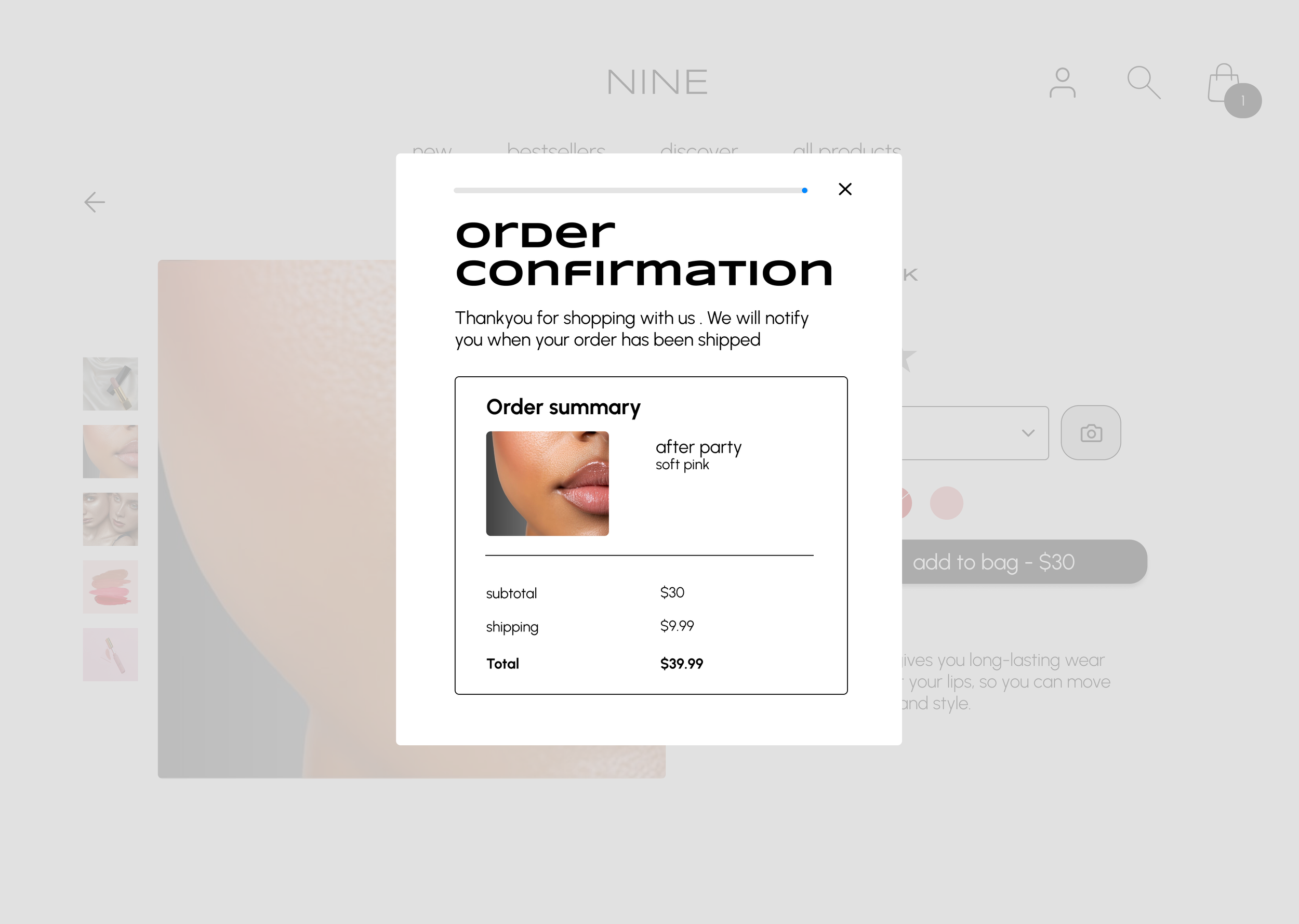
Checkout Confidence
Users felt uncertain about steps.
ITERATIONS: Add a clear progress indicator
Phase 6
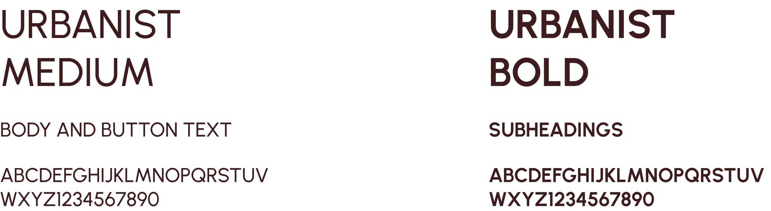
Iterations/Redesign
Based on insights from the first and second round of usability testing, I implemented several key design refinements to strengthen both functionality and visual consistency. Typography was simplified to two main fonts for a cleaner, more cohesive look, and clear primary and secondary buttons were defined to improve hierarchy across the interface. I standardized card and image corner radius for a unified visual feel, and refined the “Compare Shades” feature by limiting it within the “Upload an Image” tool to minimize confusion. Text prompts were updated for clarity — for instance, “Find Your Shade” was changed to “Skin Tone Quiz” — and a progress bar was added to the checkout flow to help users track their steps and reduce drop-offs. These updates collectively streamlined the user experience, making the site feel more intuitive, cohesive, and confidence-driven. The final prototype remains a continuous work in progress.