
5 day design sprint
PostUp is a new startup that wants to make it easier for freelancers and remote workers to find great coffee shops, free spaces, and public spaces to do work from. The goal is to run a design sprint to quickly test out a possible solution.
Problem Statement
Freelancers and remote workers often waste valuable time trying to locate work-friendly spaces that meet their specific needs, such as reliable Wi-Fi, quiet areas for calls, available seating, restrooms, and amenities, only to arrive and find the reality doesn’t match the online information. The current process of piecing together data from Google Maps, photos, and scattered reviews is inefficient, often incomplete, and leads to frustration. This is especially true for people who frequently travel between meetings and must quickly find a place to work in unfamiliar parts of the city.
Design Constraints
1| The solution must be designed as a mobile app
2| PostUp wants to help users find places that already exist
3| PostUp wants to charge a monthly fee to users in exchange for information
User Needs
User research revealed a clear pattern: when choosing a place to work remotely, people prioritize a mix of practical essentials, comfort, and personal preference. Many users need strong, reliable Wi-Fi to stay productive, and some specifically look for free options to keep costs low. Quiet, distraction-free spaces are important for those who need to take calls or focus for extended periods, while others actively avoid crowded environments to maintain concentration. Access to bathrooms and other basic amenities is a must for longer work sessions.
Beyond the basics, users also look for vibe and convenience. Some want to know how busy a place is before committing, while others prefer to see photos or a preview of the space online to avoid unpleasant surprises. Bonus points go to locations with good coffee and food, and many users value spaces that attract a like-minded community. There’s also a clear desire for simple, reliable ways to discover new work-friendly spots—especially when outside their usual area. These insights shaped the foundation of the design, ensuring the solution meets both functional and emotional user needs
Persona
Nina

Age: 29 years old
Occupation: Remote Marketing Specialist
Location: Atlanta, GA
Behaviors
Works from home but spends 3 days a week traveling around the city for meetings
Often has a few hours between meetings and tries to find places to pass the time and take calls
Isn't always familiar with the part of the city shes in
“If I’m going to work outside the house, I need solid Wi-Fi, good vibes, and no surprises. Just give me a quiet corner and a latte.”

Frustrations
Often spends more time looking for a place to work than actually working
Will find a place to work only to realize there's no reliable wifi, no restrooms, or that she needs to spend more money than planned.
Needs
Wants to find a place quickly that addresses all basic needs
Isnt too crowded/ noisy in case she needs to take a call
Interview Notes
Nina typically spends about three days a week working outside her home to meet with clients, often starting her search with local libraries. However, libraries aren’t always ideal since they don’t provide the flexibility to take calls. To find better options, she turns to the maps feature to gauge her distance from nearby public spaces. Her first step is to browse photos of potential spots, trying to get a sense of how large the space is and how close the tables are to each other. Unfortunately, she’s often met with food photos rather than images of the actual layout. Next, she checks the location’s busy times to avoid crowds and would ideally like to see real-time seat or table availability. Amenities are also a key factor in her decision-making, and she often relies on reviews to fill in the gaps—looking for details like dairy-free options, seating comfort, and overall space.
Overall Insights
Key user needs include visibility into Wi-Fi availability, noise level, crowd size, seating availability, and amenities like bathrooms and food options. The current gap is not the lack of available spaces, but the lack of centralized, reliable, and user-focused information to match workers with spaces that meet their criteria. The design opportunity lies in reducing search time and uncertainty, empowering users to make confident, quick choices that fit their work style and situational needs.
Day 1
Brainstorming & Mapping
Potential Solutions
Reliable Wi-Fi
Display Wi-Fi availability and quality (crowd-sourced speed tests).
Highlight places offering free Wi-Fi with a filter toggle.
Access to restrooms
Clearly list restroom availability and conditions in the space’s profile.
Visual preview of space
Showcase user-uploaded images that focus on seating layout and work environment, not just food.
360° virtual walkthroughs for partner venues.
Quiet spaces for calls
Include a noise-level rating (user-reported or via decibel-reading integration).
Tag “call-friendly” spots with private or semi-private seating.
Quality food & coffee
Highlight menu highlights and dietary options (vegan, dairy-free, gluten-free).
Include ratings for food and beverage quality from aggregated reviews.
Community / like-minded people
Show user reviews tagged with “good for networking” or “work-friendly crowd.”
Option to join a local “workspace finder” community for tips and meetups.
Avoiding crowds
Show real-time crowd data using Google “popular times” API or similar live foot traffic tools.
Indicate seating availability (crowd-sourced or via venue partnership).
Easy search
GPS-based “Find Workspaces Near Me” button.
Map view with filters (Wi-Fi quality, noise level, crowd size, amenities).
Features
A live occupancy bar graph
Seat map with green/red dots
Emoji-based crowd mood meter
Swipeable “busy → quiet” slider
Integration with Google Popular Times
Live user check-ins
AR overlay showing available tables
Push alerts for nearby low-crowd cafés
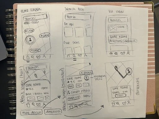
End to End Jouney

Opens app
Checks photos & seating layout
Allows location access
Sees real-time crowd level & amenities
Selects filters
Selects a location and views directions
Views list or map of results
Optionally leaves a quick review for future users
Day 2
Sketching
Speed-running through clever ideas from other products, borrowing the best parts, and making them into something unique.
Similar Applications
I drew inspiration from a variety of existing platforms to spark design ideas for this project. For example, I loved how Yelp filters by amenities, how Google displays a “Popular Times” graph, Airbnb’s clean photo galleries and amenity checklists, and Spotify’s personalized recommendation feed. Building on these references, I conducted a competitive analysis of two platforms to better understand how current products support remote workers in finding reliable, work-friendly spaces.
Workfrom.co
Workfrom emerged as the most feature-rich option, offering detailed crowdsourced reviews, verified Wi-Fi quality information, noise level tags, and clear indicators for power outlet availability. Its interactive map and robust photo galleries make it easy to visualize spaces, and its amenity filters are comprehensive. However, it lacks real-time crowd data and requires an internet connection to use.
The full analysis revealed an opportunity to create a platform that combines Workfrom’s robust filtering and clarity with Nomader’s global accessibility, while also addressing key gaps such as real-time crowd visibility and clearer space imagery. This would allow users to make more confident, informed decisions about where to work.
Nomander
Nomader provides a broad global reach but offers fewer structured filters and relies heavily on user reviews for details like noise levels and outlet availability. Its UI feels less polished, and crowd data is missing entirely.
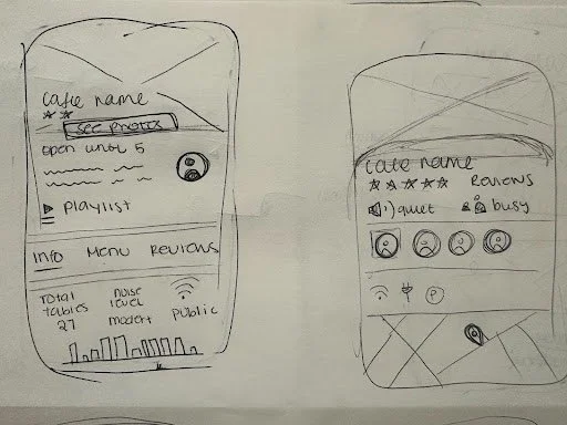
Most Critical Screen: Cafe Details Page
Reliable Wi-Fi is essential, along with clear noise level indicators and whether the space is suitable for calls. Real-time crowd information, seat availability, and busy time graphs help users plan ahead. Photos that show seating layouts and table spacing make it easier to assess comfort before arriving.
Users also want a simple list of amenities like restrooms, power outlets, and coffee or food quality. Built-in navigation with maps, directions, and a “find nearby workspaces” option supports flexibility. Community vibe matters too, with tags for networking or solo work, atmosphere ratings, and quick story-style updates from guests.
Photo galleries should reflect the actual space, and reviews should focus on work-related details like Wi-Fi and noise. Basic information such as hours, contact details, and websites should be easy to access. Optional features like café story feeds and playlist previews can give users a feel for the space before they arrive.
Crazy 8’s Sketches
Day 3
Deciding
Red Route Sketch
Day 4
Prototyping
The process pushed me to narrow big ideas into an MVP focused on Nina’s frustrations: wasting time. Comparing existing apps helped me see what worked, but I focused on a user-first solution. The challenge was balancing ambitious ideas with what actually solves the core problem.
Day 5
Testing
To validate if the app makes decisions faster, easier, and more trustworthy. Specifically, do users feel confident choosing a workspace, are filters intuitive, and does the detail page answer their top questions?
P1:
Works in multiple parts of the city, often between meetings.
Needs quick Wi-Fi and quiet space for calls.
Tech-savvy, used to trying new apps.
Profile
Age: 32
Job: Marketing Consultant
P3:
Loved how quickly she could filter for quiet + Wi-Fi, but wanted an even faster “one-tap” option.
Travels with gear, prefers cafés with space and outlets.
Wants to see crowd level before committing.
Relies heavily on visuals before going anywhere..
Profile
Age: 27
Job: Freelance Videographer
P4:
Found the seating info very helpful, but wished the photos were bigger and easier to swipe.
Works on papers in cafés, bonus points for good coffee.
Often frustrated when bathrooms aren’t available.
New to using apps beyond Google Maps.
Profile
Age: 24
Job: Graduate Student
P5:
Was excited about the idea for tags like “networking friendly”, but pointed out some buttons could be more visually consistent.
Constantly on the road, new city every week.
Needs easy “Find Near Me” search in unfamiliar areas.
Skeptical of new tools; expects things to be fast and clear.
Profile
Age: 38
Job: Sales rep
Likes the favorite feature. She did note that too many icons on the map could get overwhelming.
Obsessed with sleek UI and playful features.
Enjoys exploring community reviews.
Wants to know seating layout before showing up.
Profile
Age: 21
Job: UX Intern
P2:
Said it would save her the “trial and error” she usually goes through. She needed a bit more hand-holding to understand filters.
Summary
Patterns noticed:
Filters are clear and valuable, but some users wanted even faster shortcuts
The café detail page was universally praised — especially the Wi-Fi info, story feature, and restroom icons.
Users loved visuals, but wanted them larger or easier to browse.
“Find Near Me” was crucial for travelers; location access must be seamless
Playful/community features (stories and playlist) add personality but should not distract from core utility.
Overall takeaway:
The prototype solved the core frustration of wasting time searching. Users felt more confident making decisions and liked having all the essentials (Wi-Fi, noise, crowds, restrooms) in one place. The main improvements needed are bigger visuals, and a cleaner map UI.