


ThymeBomb
A UX case study focused on reimagining how individuals with dietary restrictions discover safe and satisfying meals without the stress. The result is a concept for a bold and inclusive platform that acts as a search engine for safe foods that don’t feel like a compromise.
Role
UX/UI Designer
Year
2025


The visuals aim to be playful yet grounded, making everyone feel like they have a seat at the table.


Users can find what they need without friction. Every decision was made to feel inclusive, approachable, and useful.


Problem Space
While working in the restaurant industry, I noticed a recurring issue: customers with allergies and dietary restrictions often felt like an afterthought. These individuals were frequently met with limited, bland options or confusion and misinformation from staff. Menus weren’t built with them in mind and the frustration was palpable. The idea for ThymeBomb was born from this gap.
I wanted to create a way for these individuals to have a smoother dining experience, but after conducting enough research, I would learn that there was a more prominent need to be addressed.
Research Methods
Research & Discovery
Real-world observation (restaurant industry pain points)
Screener survey (participant qualification & early insight)
User interviews (5 participants)
Iterative problem reframing
Competitive & Contextual Analysis
Comparative analysis (market & feature research)
Insight synthesis (identifying opportunities)
Synthesis & Insights
Affinity mapping
Empathy maps
Personas
Jobs to Be Done (functional, emotional, and social needs)
Strategy & Structure
Site map (information architecture)
User journey map
Design brainstorming (feature prioritization)
Discovery
Assumption: Individuals with dietary restrictions need more ways to make their dining experience less stressful.
Goal: Secondary research. Learn more about who these individuals are.

“What challenges do individuals with dietary restrictions face during the dining experience?”
Relevant Insights

53%
of allergic reactions occured despite notifying restaurant

27%
happened when allergens were listed on the menu

14%
occurred even after ordering responsibly and informing staff
Dining out is the second most common location for food allergic reactions, following reactions at home. There are many ways that diners can do their due diligence, but that alone still leaves room for error on the part of restaurant staff.
Next step: Primary research
Screener survey was administered to a pool of 23 people. Participants were chosen based on diversity in age, diet, dining frequency, and general frustrations.

Interviews with Participants
Participants: 5
Time: 30 minutes each
Goal: Gather enough information to experience dining frustrations through the lens of each participant. Questions were organized in 5 main categories to gain empathy and understanding.
1|
Communicating with staff
What challenges have you faced when trying to explain your dietary restrictions?
How do you typically handle these situations?
Menu Options
2|
How confident are you in the accuracy of menus and the information provided about ingredients?
Do restaurants typically have dedicated options for your needs?
3|
Social/Psych. Impacts
Have you ever felt left out or frustrated in social settings due to the lack of accommodating options?
How could this be alleviated for you?
4|
Problem Solving
If you could design the perfect dining experience for someone with your dietary needs, what would it look like?
What kind of accommodations do you wish were more commonly available?
Day-to-day Experiences
5|
If you could design the perfect dining experience for someone with your dietary needs, what would it look like?
What kind of accommodations do you wish were more commonly available?
“—it’s a lot of repetition. Meal prep is part of my Sunday routine, kind of my self-care time, but it's always the same stuff.
Age
40-49
Restriction
Lifestyle choice
Pain Point
Compromising taste for health
Participant A:
Participant B:
“I wish I could just go to a website, click on ingredients I need to avoid, and instantly get recipes—like a Google search for food allergies."
Age
40-49
Restriction
Gluten
Pain Point
Finding diversity in family meals
Participant C:
Age
50+
Restriction
Ulcerative Colitis
Pain Point
Limited confidence in cooking skills
“Because of an extremely busy job and having kids, I didn't take the time that I needed to invest in myself”
Synthesizing Insights
Goal: Identify patterns, insights, and organize key themes
Looking beyond the surface is necessary for truly understanding an issue. See it… then flip it over so that you can find what's underneath.
Affinity Map
Organizing insights and forming a clear direction grounded in real user needs, not just assumptions.

During interviews, it quickly became clear that participants were less focused on restaurant experiences and more concerned with what they could eat at home. Every time I brought up dining out, the conversation hit a wall. Most didn’t have much to say, likely because they had little control in those settings. But when I shifted gears and asked about day-to-day life with dietary restrictions, the floodgates opened.
That’s when it clicked: the real challenge wasn’t in dining out, it was finding meals at home that felt satisfying and doable for themselves and their families.

The Novice
Insecure in the kitchen
Missing their old lifestyle
Feels

Eating a restrictive diet means I wont enjoy my meals anymore
Says
Uses the internet to research safe recipes
Has the same meals in rotation
Spends money on takeout
Does

The Veteran
Bored of eating the same things
Frustrated with lack of time
Feels

I want to be healthy, but I also want to really enjoy what I’m eating
Says
Cooks the same meals every week
Avoids eating out due to fear of cross contamination
Cooks meals that will last
Does
Jobs to be done
Find meals that are diet friendly
Discover new ways to be creative
Diversify meals without compromising
health
Create more time to focus
Explore new flavors
Main
Feel more confident in the kitchen
Feel inspired by fresh ideas
Enjoy healthy eating
Feel empowered and not limited
Emotional
Share meals with loved ones
Make family meals fun
Social
Personas
Rookie Ryan

Age: 25 years old
Status:Dating
Occupation: Bartender
Location: Downtown
Restriction: Medical
Archetype: The Novice
Ryan is an energetic, social guy who thrives on new experiences and is always on the move. He loves hiking, bar-hopping, and trying out exciting activities around the city. Recently, Ryan was diagnosed with Crohn’s disease, and the news has forced him to rethink his lifestyle—particularly his eating habits. Up until now, he’s never prioritized cooking or nutrition, often grabbing convenient meals and rarely cooking at home.
I’m officially tired of plain chicken and rice. I need Crohn’s-friendly meals that won’t make me feel like I’m eating cardboard.

Frustrations
Experience: Ryan considers himself a “bad cook” and finds even basic recipes intimidating.
Nutrition Basics: With minimal understanding of nutrition, he’s unsure which foods are beneficial or harmful for managing his Crohn’s symptoms.
Maintaining a Social Life: Ryan worries that dietary restrictions will make socializing harder, as he’s used to eating out or ordering food with friends.
Needs

Momma Mia

Age: 35 years old
Status: Married/2 Kids
Occupation: Boutique Owner
Location: Suburbs
Restriction: Allergies
Archetype: The Mother
Mia is a dedicated small business owner who runs a boutique, which demands her full attention. She’s hands-on with everything and although she’s deeply committed to her work, Mia equally values quality time with her family. Her kids have specific dietary needs due to food allergies and are also quite picky, preferring “fun” meals over traditional dishes, which adds a layer of complexity.
I need recipes that are fast, allergy-friendly, and look fun enough for my kids to actually want to eat them.
Time Constraints: With her demanding work schedule, she has limited time to cook, so elaborate recipes are out of the question.
Lack of Inspiration: Mia often feels stuck in a rut, preparing the same allergy-safe meals on repeat and struggling to find new, creative ideas.
Sophie doesn’t have time to sift through long or complicated recipes online.
Frustrations

Needs
Hippy Hannah

Age: 28 years old
Status: Single
Occupation: Yoga Instructor
Location: Midtown
Restriction: Lifestyle
Archetype: The Creative
Hannah is a health-conscious vegan who teaches yoga and is deeply immersed in the wellness community. She enjoys a flexible schedule, which gives her time to explore new interests, including cooking. She loves experimenting with plant-based meals and she’s excited to tackle more intricate vegan recipes, using fresh, whole ingredients. Hannah is also very conscious about food waste and strives to make the most out of every ingredient.
I love experimenting with new vegan recipes. I’m up for a challenge—bring on the intricate dishes!
Simplified Recipes: Hannah finds that many vegan recipes are too simple for her taste. She’s looking for more complex, creative dishes to challenge her cooking skills.
Lack of Sustainable Recipes: She sometimes struggles to find recipes that match her values of minimal waste and sustainability.
Frustrations

Needs
Reframing the problem
After synthesizing the data, it became clear that the core need wasn’t restaurant staff education, it was giving users more tools and confidence to discover and enjoy meals that meet their needs. This insight shifted my focus toward creating a tool that empowers people at home.
It’s not just about recipes. It’s about taking agency where we can and building confidence. It’s about saving time and learning new skills.
I knew I wanted to create something that directly addressed the struggles participants shared during the interviews. Something that made it easier to find recipes, learn and gain confidence, and save time in the kitchen.
Next step: Explore other applications with similar goals to see whats working and what isn’t.
Comparative & Contextual Analysis
As a first time user exploring these applications, I was able to have unbiased insights into what works and what causes friction.
1|
Mealime
A meal‑planning app that helps you pick recipes based on your preferences, allergies, and taste. It then auto-generates a weekly meal plan and organized grocery list.
What Works: grocery lists and customizable meal plans are seamlessly integrated. The interface is simple and clean, and the app confirms actions effectively.
What Doesn’t: The calendar is a basic list view, limiting its usability. Advanced features like meal history lacking. The free version is extremely basic with limited free recipes.
Opportunities: Introduce a full calendar view to enhance planning and provide more robust recipe organization options.


New users are able to easily navigate the interface with suggestions for next steps and instructions

Users are able to adjust their meal prep preferences by serving size

Users are able to customize recipe feed based on allergies and preferences


“Calendar view” is misleading. The only difference between “calendar view” and “list view” is the days listed above
2|
Tasty
A BuzzFeed-backed cooking companion featuring recipes with built-in video guides, personalized collections, and built‑in grocery list.
What Works: Offers diverse filtering options and a fun “cookbooks” feature for organizing recipes. Tags like “easy” and “one pot” make recipe browsing intuitive.
What Doesn’t: The interface feels busy and inconsistent, with cartoon accents conflicting with high-quality images. Broken sign-in methods hinder usability (there is an option to sign in with phone number, but this option is no longer supported by the app - may be outdated)

The profile page is familiar, intuitive, and organized. Users are able to save recipes and also organize them into their own personalized cookbooks.

Users are able to browse recipes by category which is great for inspiration.

There is a community tab for users to review and share recipes. This is good for interaction and may assist in providing a level of trust in recipes.

While the buttons are great for interaction and navigation, the color pallet for this app does not align with the brand and the use of red for action items may cause friction
Opportunities:
Simplify the design for clarity and fix broken sign-in flows to maintain user trust.
Not ideal for kitchen newbies some users say the videos skip over cooking fundamentals
recipes can lean toward flashy and sweet over home-cook practical .
3|
Plan to Eat
A meal planning tool that helps you import your own recipes or recipes from the internet. Plan meals on a drag-and-drop calendar, and auto-generate aisle-sorted grocery lists.
What Works: The app excels at importing recipes and organizing them into meal plans. The light/dark mode option improves user accessibility.
What Doesn’t: Grocery list editing is not intuitive as it could be. The calendar view is cluttered.
Opportunities: make grocery list editing more intuitive and enhance the calendar design for clarity. Add a recipe browsing feature to allow users to sift through uploads.

Multiple options for users to choose from while navigating through app

Unable to manually edit grocery lists before continuing to grocery delivery

Multiple delivery and pickup methods for users

Busy calendar interface causes friction
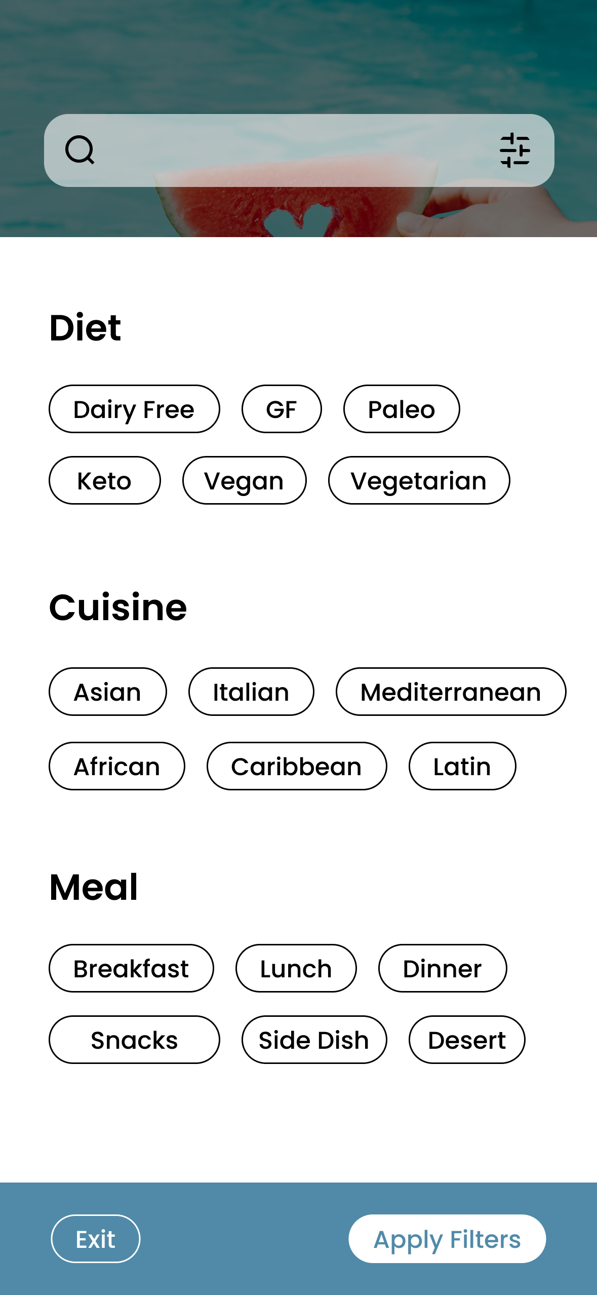
Areas of Opportunity for ThymeBomb
Maintain a minimalist and consistent UI aesthetic
Combine flexibility with intuitive editing features, such as grocery list editing and multi-day recipe assignments.
Offer a social features such as commenting and reviews
Allow users to import recipes from the internet
Strategy and Structure
User Stories
To get a clearer picture of who I was designing for, I wrote up user stories that captured their goals, struggles, and what they’re really looking for. It helped me stay focused on real people, not just potential business goals.
Site Map
Before jumping into design, I mapped out the site structure to keep things clear and easy to navigate. This helped me organize all the content in a way that actually makes sense for myself and the users.
User Flow
I created user flows to map out how people would move through the site. The goal was to make sure every step felt smooth, intuitive, and didn’t leave users wondering what they should do next.
Everything up to this point laid the groundwork for intentional, user-focused design choices that not only look good, but actually work.


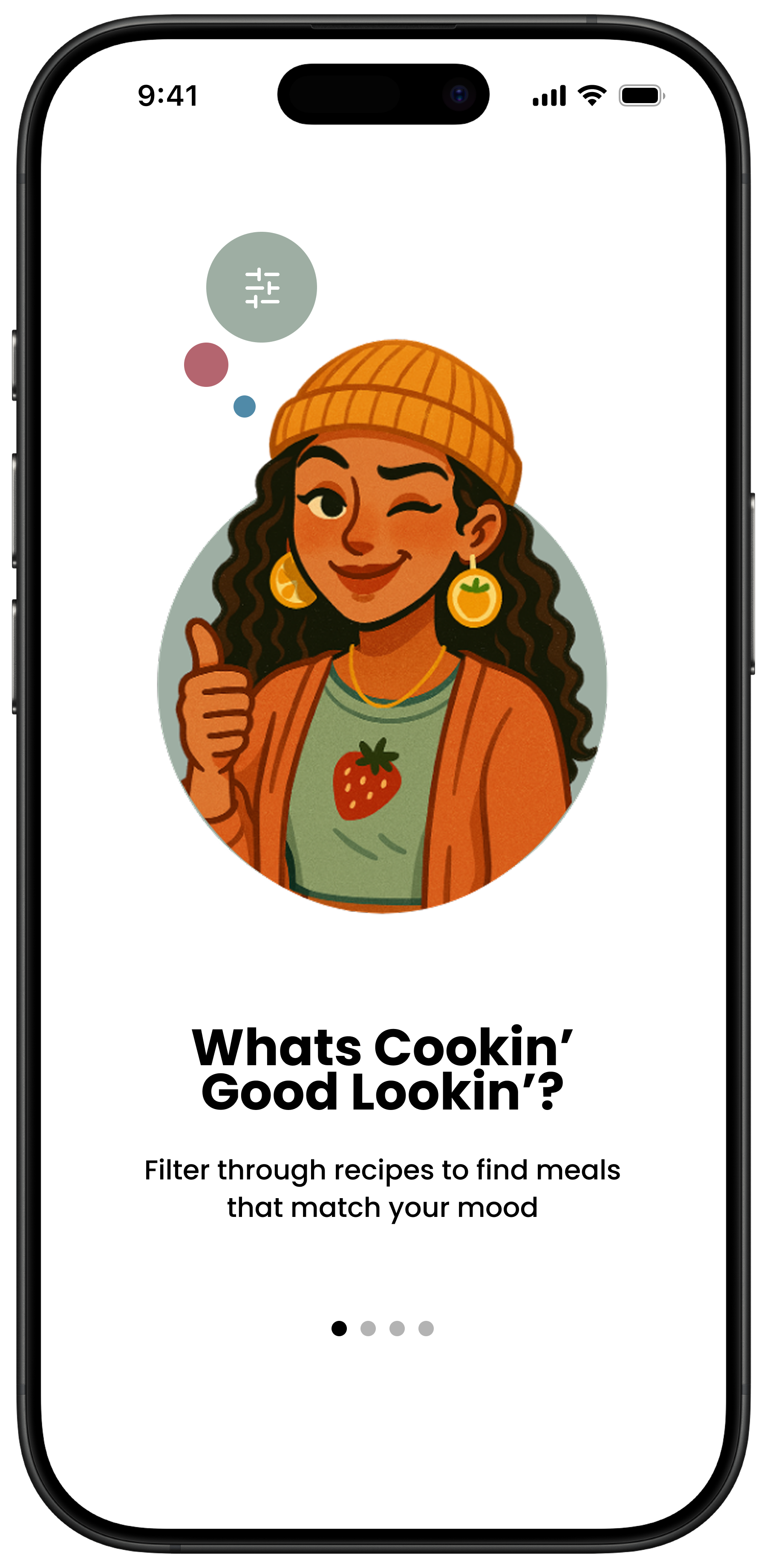
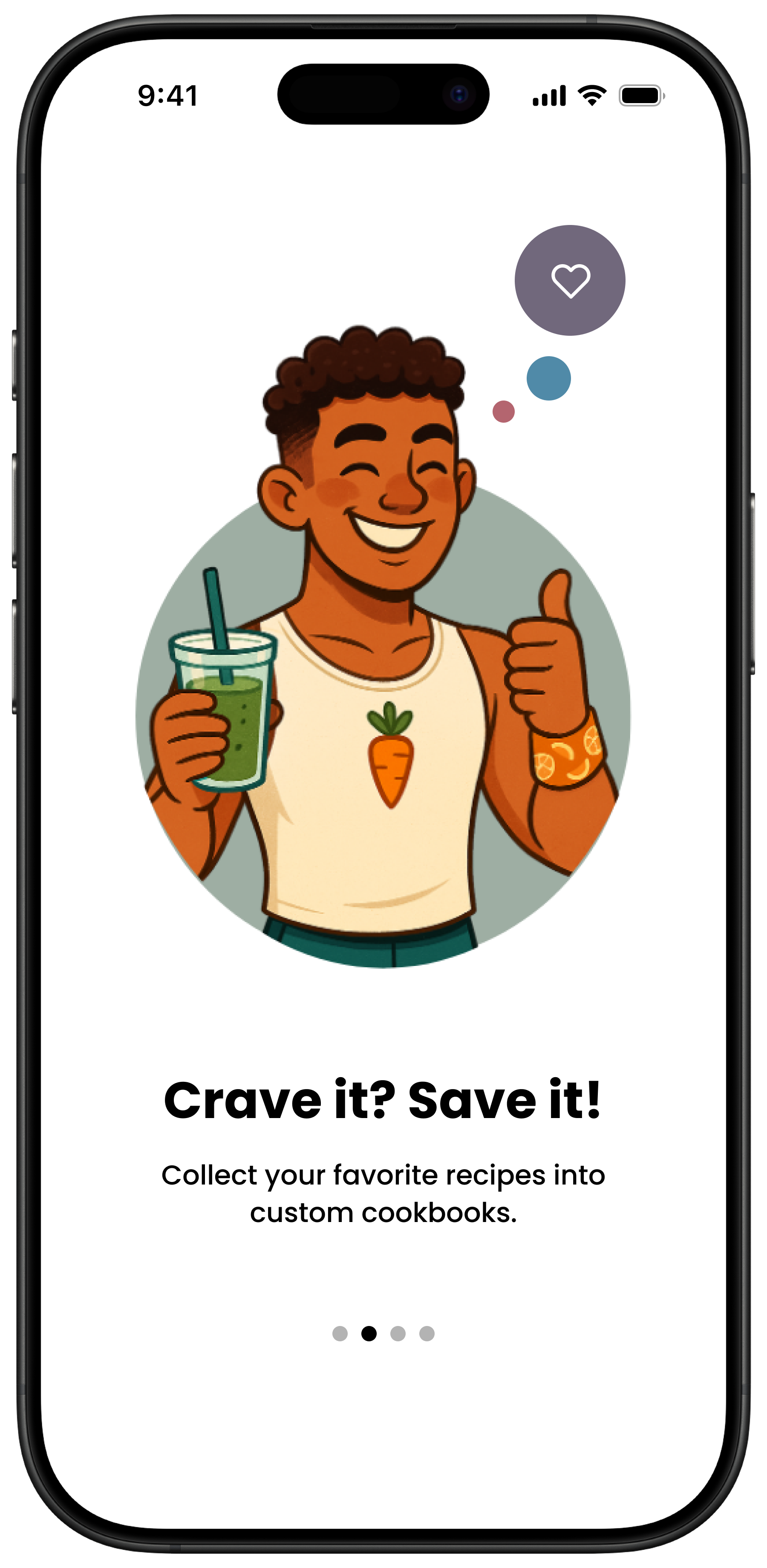
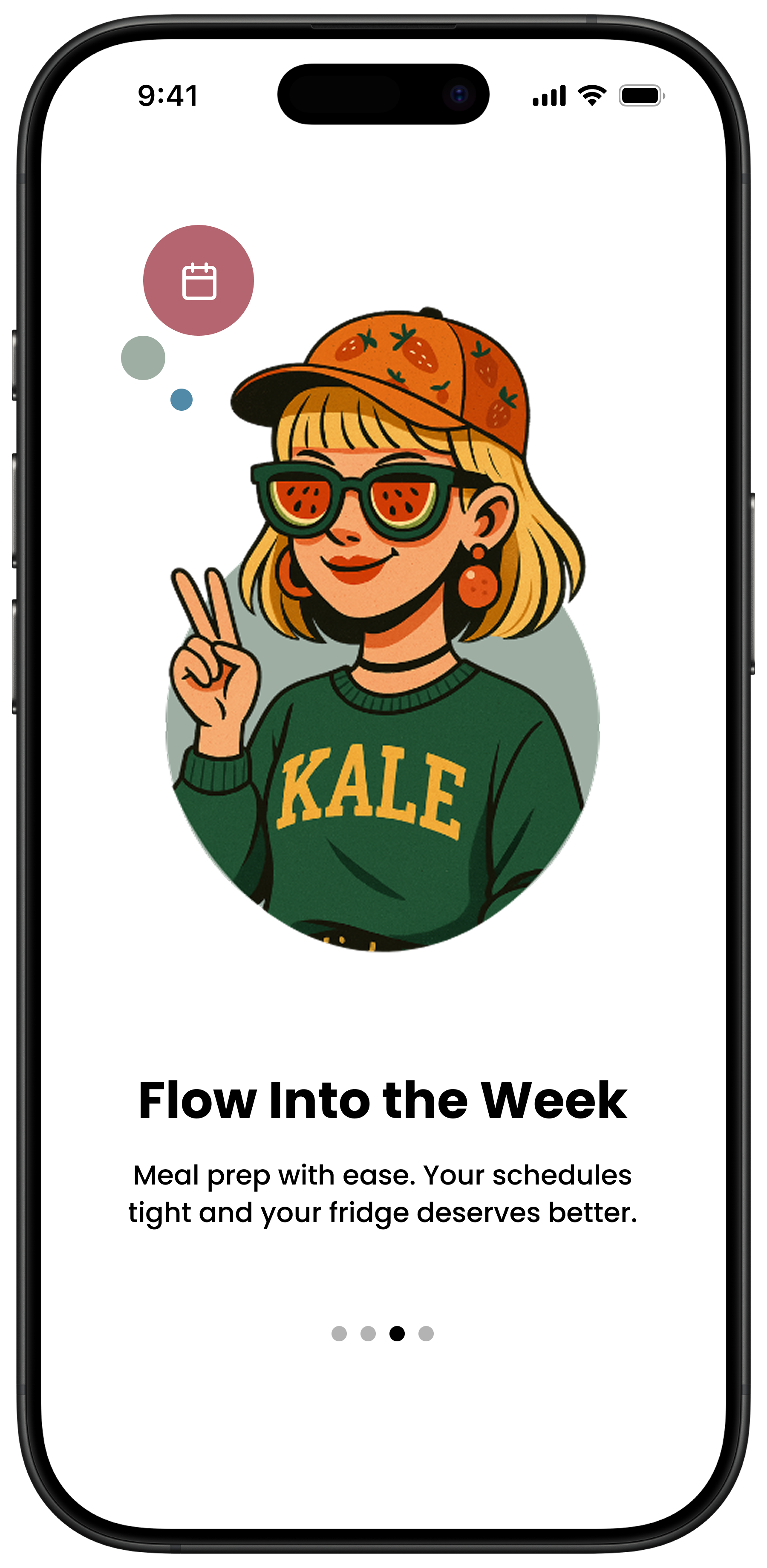
Branding and Visual Identity
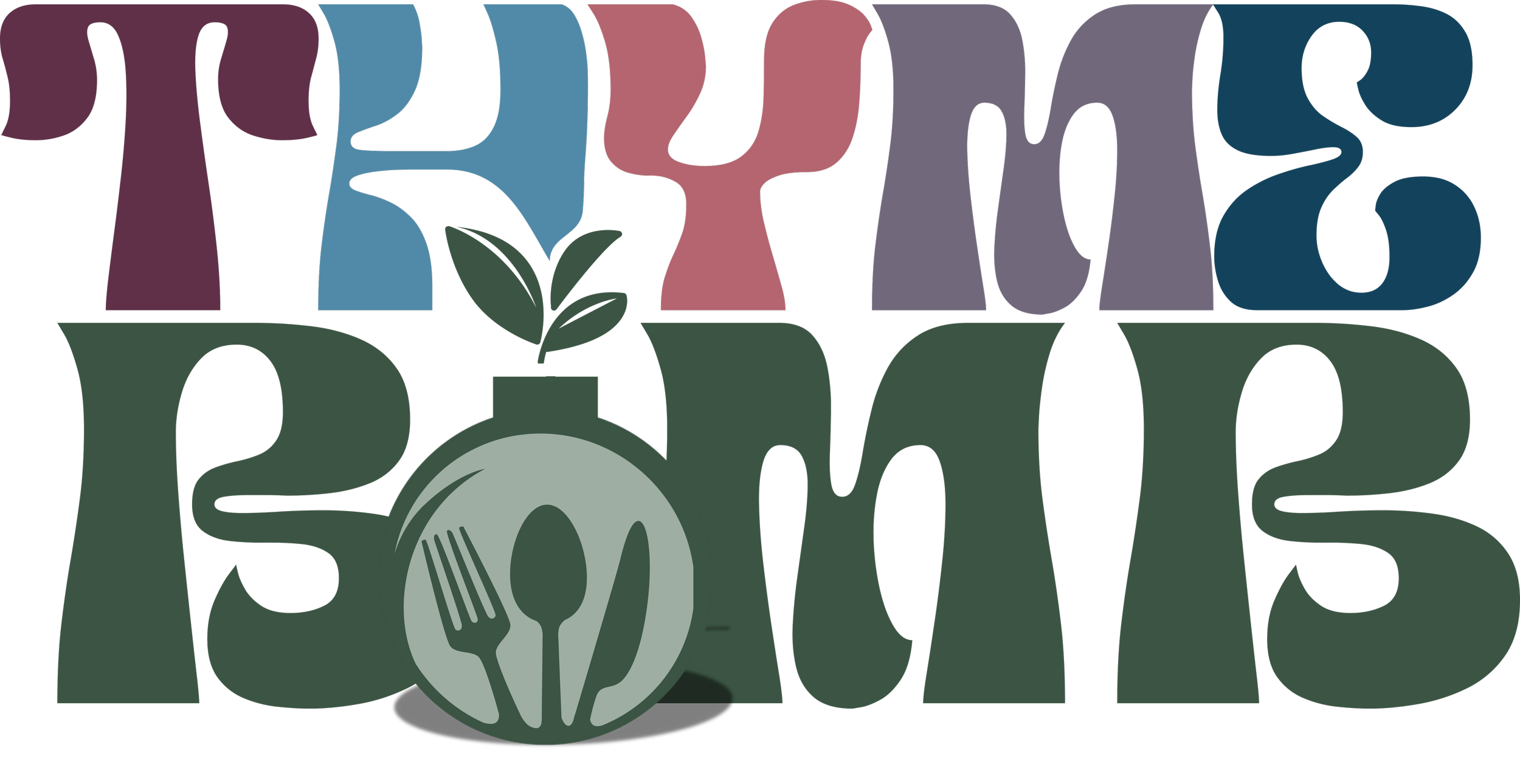
Originally intended to reflect time-saving, ThymeBomb evolved into a witty, personality-driven brand name. It’s memorable, playful, and perfectly punny.
Minimalist Design
Every design element serves a purpose—nothing extra. This keeps users focused, reduces friction, and invites them to explore at their own pace.
Conversational Text
Warm, human copy like “We saved you a seat at the table” replaces cold CTAs like “Sign up to continue.” This builds trust, softens onboarding, and makes users feel like part of something.
Inclusive Characters
Characters are diverse in race, gender, and personality—each one helps users feel seen. They appear throughout onboarding and interactions to make the app feel like a friend, not a tool.
Mood Board
Fun, edgy, approachable, and empowering. It balances a playful, yet sophisticated edge with an inclusive spirit and sense of expertise.


Logo Iterations
Exploring form, type, and tone. Each iteration brought me closer to a brand identity that feels intentional, modern, and unique.


#b4656f

#508aa8
#5f3047

#72687c
Earth tones inspired by smoothie bowls and veggie gardens ground the app in a natural, fresh aesthetic. The soft blue pulled from the logo recurs throughout the UI to build trust, convey calm, and tie everything together.
#13445c


The font choice is playful and energizing—a clear departure from the sterile, corporate feel of most recipe apps. It reinforces approachability and charm.
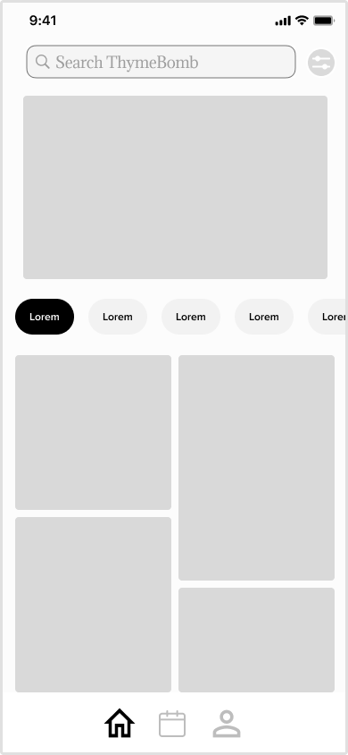
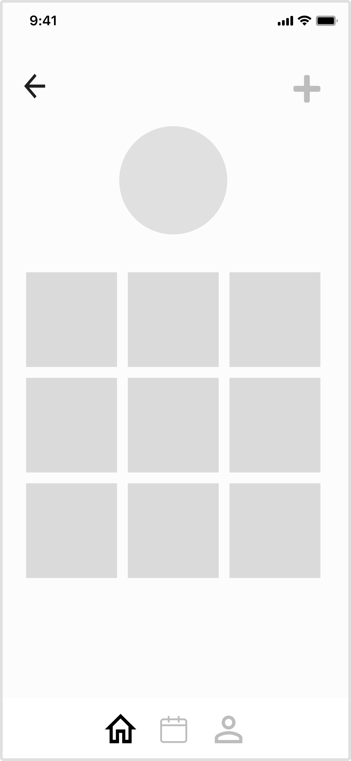
01 | Sketches


02| Low Fidelity Mockups


03| High Fidelity Prototype with Usability Test Report
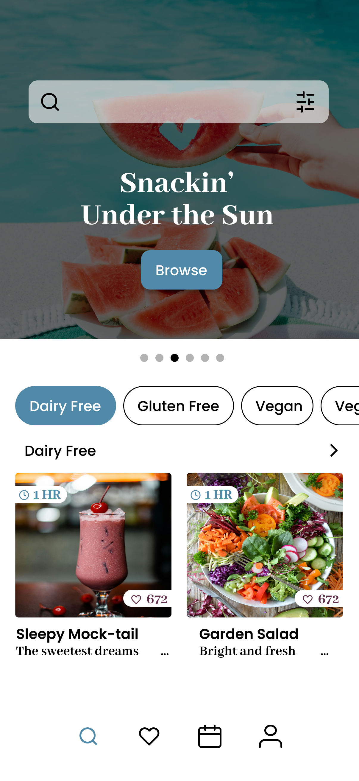

This report synthesizes findings from moderated usability testing sessions with five participants. Each participant completed three tasks using the ThymeBomb mid fidelity prototype.
Tasks
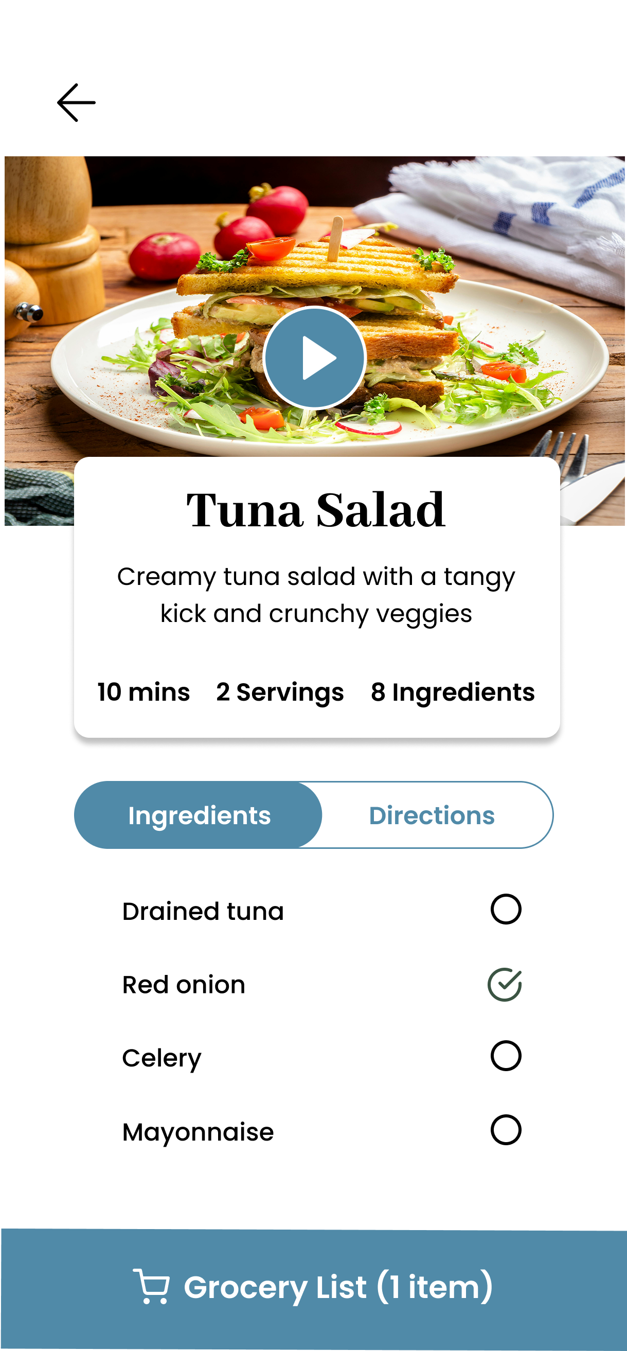
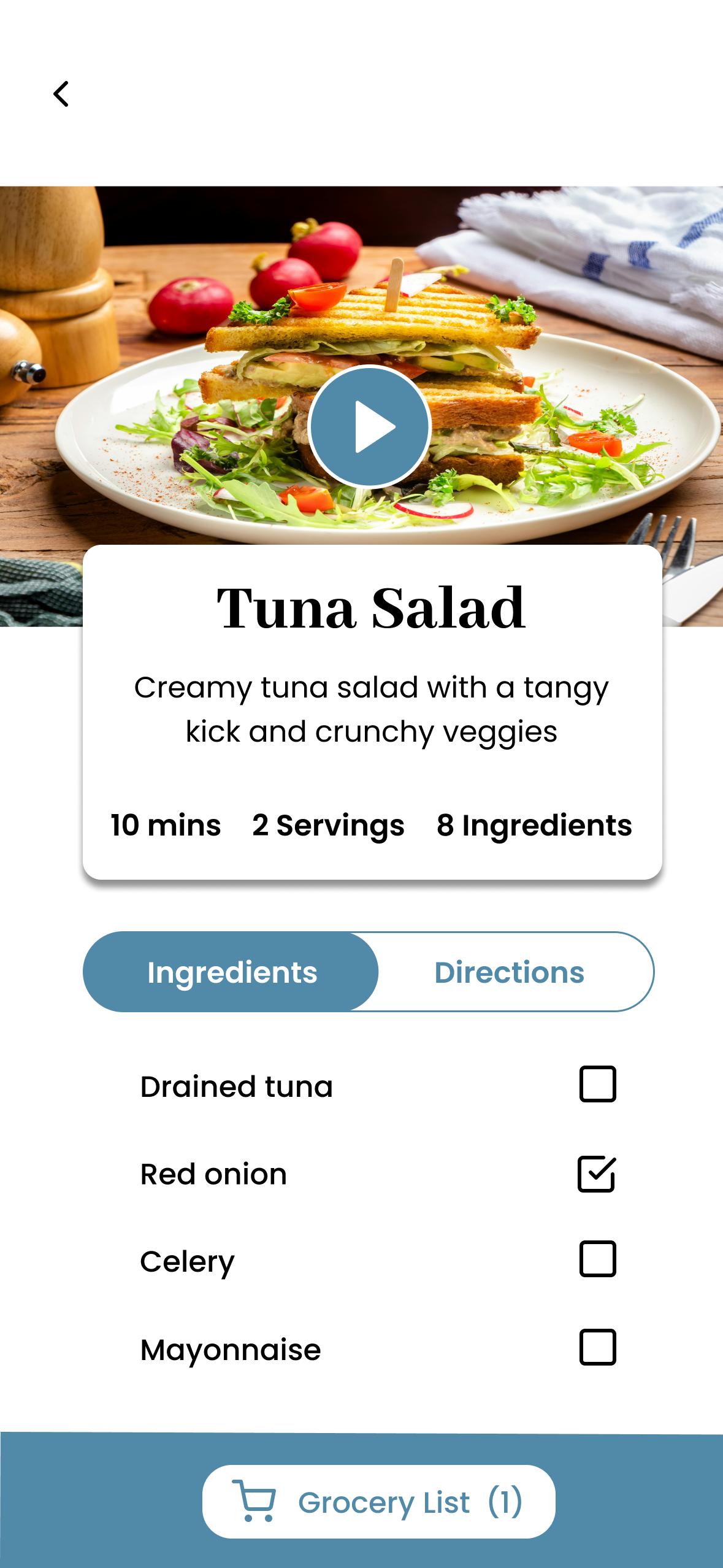
Find a keto lunch recipe for tuna salad and save it to your meal plan.
Find a recipe for tuna salad and save it to your favorites.
Create a new cookbook.
Objectives
Assess first impressions of ThymeBomb’s interface and uncover usability issues within the red routes
Methods
Moderated In-person with 5 participants for 20 minutes each
P1:
Observations
She took her time looking over each screen and pressed the buttons that made the most sense. Her tasks were completed with little to no friction.
Feedback
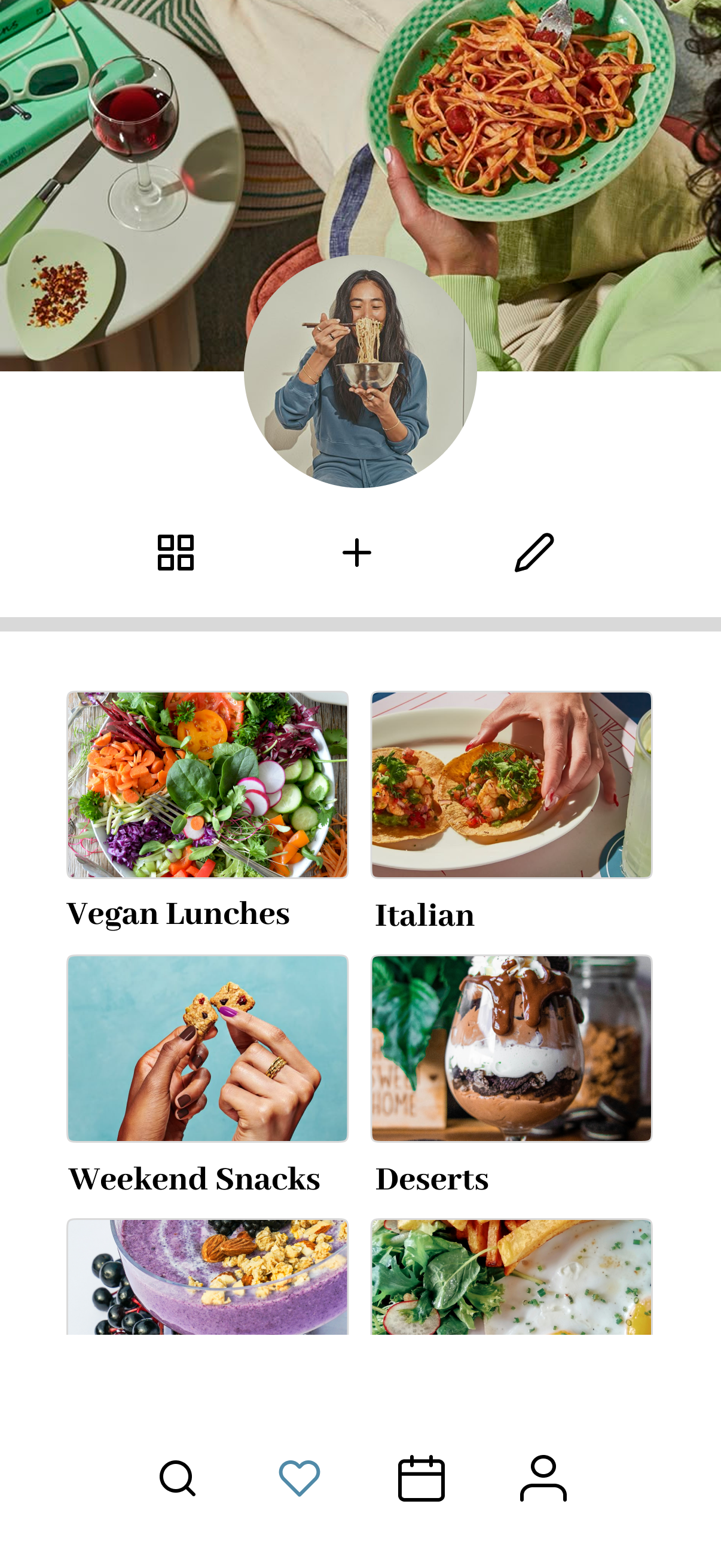
“I was expecting the option for creating a new cookbook to be under the profile icon”
Profile
Age: 27
Gender: F
Diet: Lifestyle
Cooking frequency: Frequent
Current apps: Pinterest
Needs: Novelty
P2:
Observations
There was a lot of clicking around and “exploring” happening before each task was focused on. I noticed while exploring, he was having trouble getting back to the home screen- there seemed to be some confusion about the icons used.
Feedback
He stated that having more directions and prompts throughout the app would make things more clear for him, specifically on the meal calendar page. He also stated that having a “home” icon instead of a search icon would make more sense to navigate back to the home screen.
Profile
Age: 25
Gender: M
Diet: Lifestyle
Cooking frequency: Moderate
Current apps: None
Needs: Time efficiency
P3:
Observations
Pressed on the profile button while searching for options to create a new cookbook.
Feedback
“If I didn't know that the app offered a meal planning option, the calendar icon could be a calendar for anything”.
Profile
Age: 25
Gender: M
Diet: Pescatarian and allergies
Cooking frequency: Often
Current apps: None
Needs: efficiency and taste
P4:
Observations
Pressed on the meal calendar nav icon when prompted to add a recipe to the meal plan. I also noticed a shocked expression when looking at the page to the left.
Feedback
When asked how he felt about the page he stated that it was different but not in a bad way. This leads me to the realization that this style interface is geared more towards millennials and gen z.
Profile
Age: 50
Gender: M
Diet: Medical
Cooking frequency: Family Cook
Current apps: Google searches
Needs: Quantity and allergy sensitive
P5:
Observations
When asked to add a meal to her calendar, she also navigated to the "calendar" nav icon but quickly rerouted to the search feature.
Feedback
She stated that a home button would be helpful along with more information in the onboarding process.
Profile
Age:45
Gender: F
Diet: Lifestyle
Cooking frequency: Daily
Current apps: Physical cookbooks and family recipes
Needs: quantity and fuel
Usability Issues and Severity
Cookbook Feature Placement
Users expected to find "Create New Cookbook" under their profile, not under the heart icon.
ITERATIONS: Move cookbook creation to the profile section.
Missing Home Button
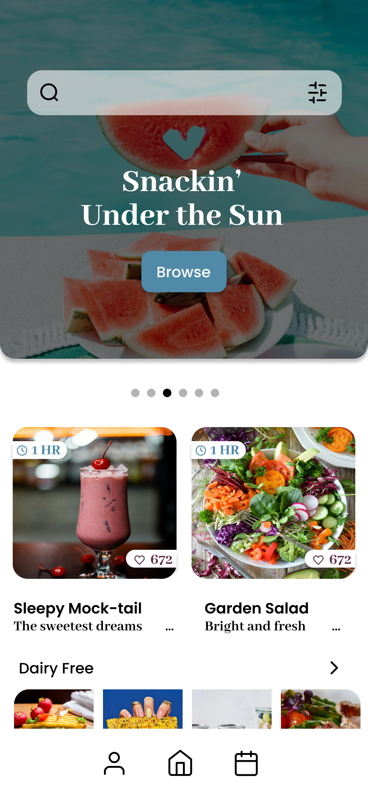
Multiple users struggled to return to the homepage. The current icon (search) is misleading.
ITERATIONS: Replace with a clear home icon in the navbar.
Sparse Onboarding
Unclear Calendar Icon
Several users expressed confusion early on due to a lack of app guidance.
ITERATIONS: Add onboarding walkthrough to give first-time users clarity and confidence
Users didn’t connect the calendar icon to meal planning.
ITERATIONS: Move cookbook creation to the profile section.
Navigation Complexity
Some users got lost while exploring and struggled to get back.
ITERATIONS: Simplify nav icons.
04| Prototype Iterations
5 new participants were given the same tasks as the previous. The objective was to assess if the apps changes were effective and identify any additional pain points.
Additional Usability Issues
Recipe saving not intuitive for all
Participants hesitated slightly when trying to figure out how to save recipes.
ITERATIONS: The recipe card may need to be introduced during onboarding or show more obviously as “clickable”
Prolonged Navigation
Participants took longer than needed to return to the main screens.
ITERATIONS: A fixed nav bar will be needed on more pages for faster navigation. This will be more efficient than having the users have to click the “back” button multiple times to return to the desired screen.